Scientific Accomplishments and Contributions
The
EMBYR wildfire model
From
1991-1993 I developed a spatially-explicit grid-based forest fire
model, EMBYR
(Ecological Model for Burning the Yellowstone Region), for
simulating wildfire in Yellowstone National Park, USA. EMBYR
is a probabilistic
wildfire simulation that
predicts
potential burn patterns of large fires
relative to variations in fuel types and weather patterns in an
area. Ignitions can occur at random points or specific locations,
and ignitions from firebrands can be simulated relative to fuel
type. EMBYR
requires a GIS layer of fuel types based upon age classes and
species composition. Fire spread probabilities are specified for
three possible fuel moisture conditions; wet, intermediate, or dry.
Probabilities are then adjusted using one of three wind speed
categories and one of eight wind directions. The output from EMBYR
indicates the final burn pattern of one or more potential
landscape-scale fires, allowing impacts from future fires to be
estimated. Each run is different; many
stochastic runs of the same wildfire event produces a “probability
density cloud” that shows the full statistical range of behavior
of that fire.
The
spatial resolution is 50m. EMBYR
is easily
parameterized, fast and efficient,
and shows interactions between landscape pattern and process. EMBYR
development was sponsored by the National
Science Foundation (NSF)
under "Causes and Consequences of Large-Scale Fires" (web
page describing early results here,
source code available here,
see Publication #36, describing the EMBYR
model and its behavior, with 306 citations).
In 1994, Bob
Gardner (ORNL staff) and I used EMBYR
to simulate the wildfire
regime over the next millennium for the Greater Yellowstone
Ecosystem
under three alternative, synthetic, fractally-generated climate
scenarios: dry, moderate, and wet. Fuel growth and tree succession
under each scenario were simulated by a Markov transition
probability model. We performed 10
replications of 1000 years into the future for each of the three
climate scenarios
(see Publication #17, with 131 citations). Total area burned each
year was nearly
constant, regardless of the climate;
only the average
size and intensity of the wildfires changed.
In
a series of three papers (Agricultural and Forest Meteorology 1998,
Ecological Modeling 2004, and Landscape Ecology 2006), Bob Keane of
USDA Forest Service, Missoula Fire Lab, and G.J. Cary of the
Canadian Forest Service independently
compared and evaluated the sensitivity
of the EMBYR
model with four other wildfire simulation models (FIRESCAPE,
LANDSUM,
SEM-LAND,
and LAMOS(DS)).
EMBYR
was found to be one
of the most sensitive models to landscape fuel patterns,
in terms of changes in area burned.
In 2004, Town Peterson
and I used a modified version of EMBYR
to predict
the spread of the invasive Asiatic longhorned beetle,
Anoplophora
glabripennis,
across its suitable range within the United States, as modeled by
the GARP
(Genetic Algorithm for Ruleset Prediction) niche model. EMBYR
provided an excellent parallel
to species dispersal;
fires spread via ignition of adjacent areas, and also through
longer-distance dispersal by means of ‘firebrands’ — similar
to the ways
that an invasive species spreads
across a landscape. Our parameterization of EMBYR
was only intended to assess the spatial pattern of invading
populations, not the actual rates of spread. We initiated the EMBYR
spread model at 32 known points of warehouse or tree infestations in
North America (see Publication # 51, with 50 citations, acc. To
BioOne).
The
Fractal Realizer and MapCurves
In
1997, I was generating synthetic fractal maps of resource
distributions for testing models of foraging theories (see
Publication #19, 60 citations). Soon after realizing this general
need, I devised and programmed the Fractal
Landscape Realizer,
which generates
synthetic landscape maps to user specifications.
The alternative landscape realizations are not identical to the
actual maps after which they are patterned, but are similar
statistically (i.e., the areas and fractal patterns of each category
are replicated). A fractal or self-similar pattern generator is
used to provide a spatial probability surface for each category in
the synthetic map. The Fractal
Realizer
preserves the fractal patterns of all the categories in the
resulting synthetic landscape. Each synthetic landscape is one
realization from among an infinite ensemble of possible fractal
landscape map combinations. One
can use the Fractal
Landscape Realizer
to simulate an actual example landscape on-the-fly at
http://www.geobabble.org/cgi-bin/realizer/turing-map?3.
Click reload to generate another custom synthetic landscape.
Every
fractal map realization is new and different.
The
Fractal
Realizer
is useful as a generator
of “neutral models”
against which to test
for the presence of natural spatial patterns.
The Fractal
Realizer
generates null models using well-defined structuring processes which
are under the users' control. Replicated landscape maps generated
using the Fractal
Realizer
all possess
statistical properties that are similar to a particular empirical
landscape,
and can provide a baseline upon which to simulate natural processes
in order to predict or test for expected pattern. The sensitivity
of stochastic spatial simulations to prescribed input landscapes can
be evaluated by supplying
them with a series of synthetic maps
that obey particular statistical characteristics and then monitoring
changes in modeled outputs. Statistically
similar input landscapes with different spatial re-arrangements can
be generated
and supplied to spatial models as a hedge
against pseudoreplication.
The
quality of synthetic landscapes produced by the Fractal
Realizer
was tested using an online variant of the Turing
Test.
More than 1000 ecologists and mapping specialists were presented
over the web with a series of 20 selections of paired maps, and
asked to distinguish the real map from the synthetic realization
from the Fractal
Realizer.
The resulting population
of scores was not significantly different from a random binomial,
proving that the
experts were unable to discern the synthetic maps from the actual
ones.
Anyone can take the test at any time over the web at
http://www.geobabble.org/realizer/turing.html
Since
its publication in 2002, many
thousands of people have taken the Turing Test
of the Fractal
Realizer.
Several landscape ecology and GIS classes across the country have
made the Turing
Test of the
Fractal
Realizer
a regular part
of their scheduled laboratory exercises
each year, and source
code for the Fractal
Realizer
is available
for download over the web. In April 2004, I was awarded the
Outstanding
Landscape Ecology Paper
by the International
Association of Landscape Ecology (IALE)
for the publication in Conservation
Ecology
describing the Fractal
Realizer
(see Publication #46, 58 citations,
http://www.ecologyandsociety.org/vol6/iss1/art2/)
In
2005, I developed MapCurves,
a generalized algorithm for the quantitative,
comparison of multiple categorical maps.
MapCurves
is a quantitative goodness-of-fit (GOF) method that unambiguously
shows
the degree of spatial concordance between two or more categorical
maps.
MapCurves
graphically and quantitatively evaluates the degree
of fit among any number of categorical maps
and quantifies a GOF for each polygon, as well as for the entire
map. The MapCurves
method will even indicate a perfect fit between two ecoregion maps
drawn by a “lumper” and a “splitter,” e.g., if all
ecoregions in one map are comprised of unique sets of smaller
ecoregions in the other map. It is not necessary to interpret (or
even to know) legend descriptors for the categories in the maps to
be compared, since the
degree of fit in the spatial overlay alone forms the basis for the
equivalency.
MapCurves
produces the
best translation table between categories in each map
as an output product, rather than starting with a guessed
translation table as an input. Prior to MapCurves,
meaningful quantitative
comparison of two categorical maps was nearly impossible.
One can compare two or more ecoregion maps using MapCurves,
even if the maps contain radically different numbers of ecoregions.
Two
dozen well-known ecoregion and landcover maps were compared
quantitatively using MapCurves
(see Publication #59, 88 citations). One can also use MapCurves
to “borrow”
and apply the best, most appropriate labels from another map (of
ecoregions or forest types, for example) to associate
particular category names with each statistical quantitative
ecoregion.
MapCurves
has been adopted by many others, and someone with whom I have no
connection has written a downloadable
R package
called sabre:
Spatial Association Between REgionalizations,
which calculates MapCurves
for other users.
*Clustering
Quantitative Ecoregions and LANDFIRE National Wildfire Biophysical
Settings Map
About
1997 I started experimenting with multivariate clustering as a way
to statistically delineate homogeneous ecoregions, using a set of
digital maps within a GIS as ecoregion characteristics. While
recognizing the utility and popularity of ecoregions among
ecologists and resource managers, I was dissatisfied
with the reliance on subjective expert opinion
used to produce them. I quickly realized that multivariate
clustering represented a quantitative alternative that was
transparent, objective, and repeatable.
Map
cells are plotted in a high-dimensional data space using
standardized values of each of their environmental characteristics
as coordinates. Cells located close to each other must
have similar mixtures of environmental characteristics,
and perhaps
should be classified in the same quantitative ecoregion.
The number of ecoregions which result is under the user's control.
Using closeness
as a surrogate for similarity,
an iterative classification procedure assigns every cell to the
closest cluster centroid. After all map cells have been assigned,
new cluster centroids are calculated to be the mean of each
coordinate over all cells assigned membership to that cluster.
Cluster centroids slowly move until the assignments converge and an
equilibrium ecoregion classification is obtained.
The algorithm was computationally
demanding,
mostly because of the large
data volumes
involved. These computational needs drove my research interest in
pioneering construction of the Stone
Soupercomputer
from discarded
personal computers
(see Publication #40).
In 1999, I produced a national
map of 1000 ecoregions created quantitatively by statistically
clustering nine environmental variables,
including physiographic, edaphic, and climatic variables at 1-km
resolution. I also created a total
soil Kjeldahl nitrogen map for the continental United States
at 1-km resolution by combining non-agricultural data from the
National
Soils Characterization Database (NSCD)
and STATSGO.
I collaborated with others to link disparate tree physiology models
to simulate tree growth across spatial scales (from leaf to stand to
regions of stands), using forcing functions to drive models at
larger scales (i.e., across
the southeastern US,
see Publications #32 and #44). Ironically, this Integrated
Modeling Project
was sponsored by the Southern Global Change Program, USDA Forest
Service, which is now a part of EFETAC
(see Publication #53, 272 citations.
Representativeness
contours along a surface created by the distance from every cell to
its clustered centroid
can be used to sharpness
or fuzziness of ecological borders, or ecotones, between ecoregions
could be quantitatively characterized,
even if it changes
from side to side or along its length
(see Publication #27, with 113 citations). The top
three Principal Components
of each ecoregion, when assigned
to the three primary colors,
create a unique set of statistical
Similarity Colors for each ecoregion.
These Similarity
Colors show the degree
of similarity or difference in the environmental conditions
contained within each quantitative ecoregion. Coloring a
quantitative ecoregion map with random colors emphasizes
the edges
between ecoregions, but the
borders disappear entirely
using Similarity
Colors,
and the map
shows the dominant environmental gradients
instead.
By submitting
multiple maps
of conditions occurring at
different times
to a single Multivariate Geographic Clustering process, a single
set of common ecoregions are formed both across space and through
time.
Although the full set of ecoregions may
not occur together within any single map,
the same set of ecoregions occurs
across the time series
of all maps. Environmental conditions
found within one ecoregion are the same, no matter wherever or
whenever
it occurs. Now quantitative statistical ecoregions can be followed
through time,
to see if they grow,
shrink, join, appear or disappear.
We call clustering through time and across space Multivariate
Spatio-Temporal Clustering (MSTC),
and it is particularly useful for tracking
current ecoregions into one or more alternative predicted futures.
Such through-time tracking is not
possible when using human expertise-based ecoregions.
In
2003, I developed the first quantitative global ecoregion maps,
sponsored by and in coordination with The
Nature Conservancy (TNC).
Single sets of quantitative ecoregions were statistically generated
for both
current global environmental conditions and future environments, as
predicted for 2050 and 2100
by two global climate models under two possible future scenarios
(http://www.geobabble.org/~hnw/global/ORNL-TNC/index.simcolors.html).
In 2005, also with TNC,
we developed the first quantitative ecoregion maps for Papua, New
Guinea and China (see Publication #83, with 63 citations). These
defensible and repeatable quantitative global ecoregions can be used
to prioritize ecological conservation and restoration
worldwide.
Using the same statistical quantitative ecoregion
method, I was funded by the USDA
Forest Service LANDFIRE
project while still at ORNL
to produce a set of National
Wildfire Biophysical Settings Regions,
based on 36
quantitative Wildfire-Relevant BioPhysical Characteristics,
to map regions having similar burning conditions across the country
for wildfire management (http://www.geobabble.org/~hnw/landfire/).
Forrest Hoffman and I also designed and contracted a 136-node,
272-processor parallel supercomputer
for the LANDFIRE,
project, and most LANDFIRE
products were produced using this parallel machine.
In 2013,
Dr. Yasemin Erguner, a citizen of Turkey, was awarded a 1-year
postdoctoral appointment, funded by the Turkish government, with the
objective of producing a set of National Ecoregions for Turkey,
under my direction, using Multivariate Geographic Clustering.
We produced not only a series of the first
quantitative Ecoregions for Turkey,
but also mapped how
those ecoregions would change under two alternative future
conditions
according to two leading Global Climate Models. The Turkish
government was interested in the possible establishment
of a National Turkish Ecological Sampling Network,
similar to NEON
in the United States, and the Turkish
Ecoregions that we produced could form the basis for those nodes,
just as our 20 Domains formed the basis for NEON
nodes. This work resulted in Publication #109,
.
In
2000, David Stoms and I argued that Normalized
Difference Vegetation Index
(NDVI),
or “satellite greenness,” was a potentially important way to
monitor
vegetation health over wide areas
(see Publication #29, 85 citations). Rather than clustering many
different environmental characteristics, I began clustering repeated
measurements of a single variable, NDVI, through time
every 8 days for a full annual cycle. All locations having a
similar
annual profile shape of greenness timing
would be clustered together into the same region. We named regions
that shared the same NDVI
phenology “phenoregions,” and produced a global map of
phenoregions from AVHRR
that might be used for monitoring climatic change (see Publication
#56, 179 citations). We produced maps showing the 50
most-different national phenoregions,
each having a differently
shaped annual profile of greenness.
These clustered phenoregion maps formed the basis for analyzing
phenological trajectories of change in LanDAT
(see Accomplishment # 12).
Parallel
Multivariate
Geographic Clustering
has become one major focus of my research, and I have developed this
quantitative approach into a rich and powerful quantitative
statistical foundation that underlies many of my subsequent future
achievements, including Scientific Accomplishments #4 (Network
Analysis), #5 (Aquatic Invasives), #7 (ForeCASTS),
#9 (Crop Mapping) , #10 (Fire Regimes), and #12 (LanDAT)
listed here. Multivariate
Geographic Clustering
was involved
in 45 of my 110 listed Publications,
and continues to represent a thematic thread of continuity through
my scientific career.
*Network
Analysis, Including AmeriFlux, FLUXNET and NEON Designs
When
ecoregions are delineated using quantitative methods rather than
expert judgment (see Scientific Accomplishment #3, above), the
quantitative treatment provides a number of ecologically useful
related concepts. Two of the most interesting of these are
representativeness,
which allows maps to be drawn which show the geographic location of
all
regions which are similar to a selected ecoregion
(as used with ecological borders, above), and network
site analysis,
which shows how
well a particular network of sites represents a larger area
containing the network.
Quantitative ecoregions are of great
practical use in the design
and analysis of networks of installations or sample locations.
Once input variables of appropriate relevance, scale and quality
are chosen, the coverage and sampling intensity of any network of
sites can be analyzed statistically with respect to those selected
variables. Because the ecoregions are statistically derived, one
can select a single ecoregion of particular interest, and then
produce
a sorted vector of the similarity of all other ecoregions to the
selected one.
Coding these pairwise similarity values as gray levels, a map can
be drawn which cartographically
shows the degree of similarity of all ecoregions in the map to the
selected ecoregion of interest.
Such maps, e.g., “Smoky Mountains-ness,” show the degree
of innate multivariate similarity between a particular selected
ecoregion and the rest of the map.
This
similarity concept can also quantify how
well an established network represents all of the conditions
occurring within a map
that contains it. A network consists of a geographic constellation
of installations or facilities, or can simply represent locations
where samples have been (or will be) taken. The quantitative
similarity is now based on comparisons with multiple site locations
within the established (or planned) network.
The best
location for adding an additional new site or installation will be
shown as the
place that is the least well-represented by the current network
of existing sites. Importance values for each site can be
calculated, based on the marginal representation it adds to the
network. Such importance values can be used to minimize
the impact on representation if a site must be removed from the
network.
Finally, a network with a given number of sites can be designed
which is theoretically
optimum,
having the highest
possible representation
on the map.
Until now, sites in even large-budget networks
have been established in opportunistic,
political, or logistically-driven ways,
resulting in
undirected, organic growth.
Network analysis is simple, quantitative and defensible, and
provides the first
objective guidance for network design and evaluation
(http://www.geobabble.org/~hnw/networks/).
I
initially used this approach to determine the degree to which the
existing network of carbon eddy flux towers within the AmeriFlux
network are representative of flux environments across the
conterminous United States
(http://www.geobabble.org/~hnw/networks2/).
This
network representativeness information was used to determine how
many additional AmeriFlux towers will be required,
and where
additional towers should be placed.
In addition, the importance and uniqueness of each existing tower
to the Ameriflux
network were calculated. This
quantitative ecoregion-based approach to stratifying carbon flux may
be the fastest way to fulfill the North
American Carbon Program (NACP)
and AmeriFlux
goal of seasonally mapping sources and sinks of carbon within the
North American continent (and see FLUXNET2015
work, below). Sponsored
initially by the Office
of Biological and Ecological Research (OBER),
DOE,
I received additional funding from AmeriFlux
to continue this AmeriFlux
network analysis,
resulting in Publications #48 (80 Citations) and #50.
After
8 years of additional tower site additions and losses within
AmeriFlux,
Beverly (Bev) Law, the Director of AmeriFlux,
asked me early in 2011 if I would repeat this analysis for the
current configuration of the AmeriFlux
network. Now working in the Forest
Service,
I repeated the AmeriFlux
network analysis, and updated
representativeness results were presented at the 2011 annual
AmeriFlux meeting.
In
2016 we used network analysis to calculate global
representativeness of the FLUXNET network
of flux towers, showing
regions which were poorly represented
by the current geographic constellation of operating FLUXNET
eddy covariance towers. The FLUXNET2015
dataset (released in late 2016) contains global FLUXNET
measurements from member eddy-covariance flux towers located all
over the earth. We used our Generic
Imputer
(see Accomplishment #7) to produce monthly
global maps of ecosystem Gross Primary Productivity for 20 years,
producing planetwide monthly maps of GPP
from upscaled flux tower measurements. Paper
was submitted to Earth System Science Data
journal and received favorable peer review (see the full story under
“Publication” #108).
In 2018, Alisa Coffin contacted me,
asking if we could use our network analysis methods to calculate the
representativeness of their Long-Term
Agroecosystem Research Network (LTAR).
We have calculated national maps of LTAR
Network Representativeness,
and LTAR
Network Constituency,
based on ecological growing conditions, but LTAR
also wishes to include socio-economic variables and crop
productivity data, in order to gauge representativeness with respect
to Cropland, Grazingland, and Integrated Systems. The
representativeness analyses may be used as a way to upscale
measurements, and as an argument for funding additional LTAR
sites in poorly represented locations. Our initial
representativeness maps received an Impact
Award
at the recent LTAR
national meeting in June.
Because
of the development of these network design and representativeness
capabilities, I became involved with the early design of National
Ecological Observatory Network (NEON).
NEON
is the first ecological measurement system designed to answer
regional- to national-scale scientific questions.
A system of identical nodes was envisioned, each representing the
ecological environments within the United States. All nodes are
focused in unison on a few transformational ecological questions of
national relevance. To better sample the diverse ecological
environments of the United States, those environments were first
divided into a set of more homogeneous "strata." NEON
nodes could then be located within each stratum,
helping to ensure that their measurements can be scaled up to
represent the entire range of environments within the United States.
Multivariate
clustering based on national maps of 9 ecologically relevant
climatic "state" variables was used to repeatably define
25 national climatic zones.
These 25 climate zones were combined with dynamic air mass
seasonality data to create 20
NEON
domains,
each having relatively
homogeneous climate.
I
was invited
to become a member
of the 15-person NEON
National
Network Design Committee (NNDC),
which met two dozen times over a period of 4 years. The NNDC was
responsible for drafting the Integrated Science and Education Plan,
the Networking and Informatics Baseline Design, and the Project
Execution Plan (PEP) for NEON.
I was also involved in the NEON
Conceptual
Design Review (CDR).
These reports and review results were given to the National
Science Foundation
and the U.S. Congress, which funded NEON
construction.
Using quantitative ecoregions and optimal
network design, I suggested the national
regionalization
on which the 20
official NEON
domains
are now based (http://www.geobabble.org/~hnw/neon/neonindex/).
This summary
article on NEON in Science
mentions me by name, and the NEON
website
describes my
contribution to the development of the official NEON
domains.
These efforts resulted in Publications #65 (39 citations) and #69
(220 citations).
The
20
NEON
domains are fundamental,
underlying everything else in the NEON
network. NEON
is the largest
and most expensive environmental project that the National Science
Foundation has ever undertaken.
The NEON
network has now been completed at a cost of
more than half a million dollars,
and NEON
will have a lifespan
of 30+ years.
These
are among my
most significant and lasting scientific contributions,
and likely represent the
summit achievements of my scientific career.
I currently serve as a member on the NEON
Spatial Sampling Technical Working Group (TWG).
We
were funded by the Office
of Biological and Environmental Research (OBER)
within the Department
of Energy’s Office of Science
to use our network analysis to analyze DOE’s
two new Next
Generation Ecosystem Experiments (NGEE)-Arctic
Alaskan Climate Change ecosystem warming sites, to study the
placement of the sites within Alaska, and to estimate the
representativeness of their measurements.
NGEE-Arctic
is a major 12-year, $20M DOE research effort. Publication #92 that
resulted was selected as the Outstanding
Paper in Landscape Ecology by US-IALE in 2014.
Invasive
Species Predictions for the Great Lakes and Sudden Oak Death
In
2009, my student Matt Fitzpatrick and I developed
a model “transplantation” method
to first develop a niche model the invasive fire ant, Solenopsis
invicta,
within its native habitat and apply the model to the invaded lands,
and then to develop a second niche model within the invaded habitat
and use that to project home range in its native habitat. Although
the invader may not yet have colonized the full extent of invaded
lands, the differences quantify
the degree of release from native predators
that the invader has enjoyed in the new area. We were also among
the first to name
and discuss the challenge of “non-analog”
future climatic conditions
(see Publication #79, 271 citations).
About
the same time, hired as a consultant to the Environmental
Protection Agency
(EPA),
I predicted
the exotic aquatic organisms most likely to invade the Great Lakes
from the Ponto-Caspian Sea region. I identified the most
likely aquatic invaders
across all taxa, and predicted
the geographic extent of the potentially susceptible areas for
each species within the Great Lakes.
Aquatic
invasive species are transported with normal ship traffic, often
carried
in ballast water.
This study predicted susceptibility by quantifying
the degree of multivariate similarity of aquatic environments
worldwide to
selected locations within the Great Lakes, USA. The approach
assumes that, sooner or later, transport of invasive aquatic
organisms will occur to and from all points on the globe. Following
such human-mediated accidental transplantations, it is the
degree of similarity of the new aquatic environment to the original
environment that determines whether the invader will successfully
establish
a population in the new location.
We produced multiple sets
of aquatic ecoregions, based on six characteristics of the surface
aquatic environment. Using Multivariate
Geographic Clustering
(MGC,
see Accomplishment #3) on a parallel supercomputer, we grouped over
50M 4 km map cells into groups or clusters having similar
combinations of the six environmental conditions. When placed back
into geographic map space, these groups form geographic regions
across all
global aquatic habitats which share similar environmental conditions
(http://www.geobabble.org/~hnw/global/aquaticinvaders/,
aquaticinvaders2).
As
with maps showing “Smoky Mountains-ness” (see Accomplishment
#3), , a world map can be drawn in which the degree of multivariate
similarity between the aquatic environment in the selected location
and the aquatic environment in every other location is shown as a
shade of gray. By quantifying
the similarity between aquatic environments,
such maps show
both the locations from
which aquatic invasive organisms that are likely to survive here
might come, and
locations to
which invasive aquatic forms from this location might go
and establish a viable population (aquaticinvaders3
and aquaticinvaders4).
Using this similarity-based approach to map
global oceans and lakes into aquatic ecoregions,
it is not necessary to select particular donor and recipient
locations, nor to do the analysis on a tedious species-by-species
basis (see Publication #76). A similarity approach is also being
used to develop
global Invasibility Zones for terrestrial invasive species
(see Accomplishment #7, bottom).
The
same quantitative ecoregionalization-based process has proven useful
for mapping the risk that Sudden
Oak Death (SOD),
Phytophthora
ramorum,
will spread to other parts of the U.S. The
susceptibility of forests beyond the west coast of the United States
to SOD
is unknown, but is the subject of speculation, since the spread
of the SOD epidemic could represent a serious threat to eastern
forests.
I created
custom statistical SOD-relevant
ecoregions using national maps of conditions
likely to be limiting for P.
ramorum,
including humidity, leaf-wetness, and cool temperatures. My
analysis
of the quantitative multivariate similarity of each of these 1500
homogeneous SOD-regions
with conditions in known SOD
outbreak areas produced a continuous national
estimate of risk or susceptibility to SOD.
A
Practical Map-Analysis Tool for Corridor Detection
I
led the development of a landscape map analyzer tool which will
identify
and map corridors and barriers to plant and animal movement
across any map. Corridors are the "roadways"
most commonly used by plants and animals as they move or disperse
across a mapped landscape. The tool is based on the idea of island
biogeography, and considers the map as
isolated patches of high-quality habitat embedded in a matrix
"sea" of all other patches of lower quality.
Corridor
connectance,
whether we wish to preserve it for a threatened species or impede it
for an invasive exotic, is a
critical concept in biodiversity management.
Despite this importance, the idea
of corridors remains largely conceptual.
Few analytical management tools exist which can examine
a real-world map, quantify connectance, and identify potential
corridors.
The
tool we developed, called “Pathway
Analysis Through Habitat,”
or PATH,
uses simulated virtual plant and animal "walkers" which
are imbued with movement characteristics and preferences of
particular animal or plant species, and allows large numbers of
these imaginary digital walkers to travel over the map. Virtual
walkers representing individuals "try" to successfully
disperse
from one "island" patch of favorable habitat to another
"island" in the archipelago, and, in so doing, define and
map the best potential movement dispersal corridors. The spatial
arrangement and amount of patches of habitat, roads, urban areas and
other real-world landscape features will affect the movements and
successful dispersal of walkers, and therefore the routes of
potential corridors across the map.
PATH
provides realistic guidance for conservation and management
decisions. PATH
patch importance values can be used to direct
and prioritize planning for conservation and remediation.
A land manager can easily see which habitat patches are the most
important
targets for conservation or strenuous remediation (for a threatened
species) or for elimination (in the case of an invasive species).
In the case of an invasive species, patches important as connecting
corridors, once identified, would be the first places that a manager
would want to make
inhospitable for the invader.
Construction of unsuitable or barrier patches, or elimination of
particular favorable "bridge" patches may be suggested
which will discourage
movement of invasive species
along existing corridors. For threatened species, patches with high
importance should be vigorously
protected or preferentially remediated;
while patches with low importance are more available for alternative
use or development.
The PATH
tool was developed using funding from the Southern
Appalachian Information Node (SAIN)
of the National
Biological Information Infrastructure (NBII)
of the US
Geological Survey,
the Army
Corps of Engineers ERDC-CERL,
and the National
Petroleum Technology Office, Department of Energy.
The prototype was initially run on small artificial test maps to
evaluate its behavior for simple
artificial landscapes designed to produce expected intuitive results
, and then simple
actual landscapes
(Publication #60, with 94 citations). As a parallel application
running on a supercomputer, the PATH
tool is computationally powerful enough to analyze movements of
large megafauna across extensive,
highly-fragmented multi-state real-world landscapes.
A CERL
Technical Report, for example, describes how the PATH
tool was used to analyze Red-cockaded woodpecker movement across the
Southeastern United States (Publication #62). A manuscript showing
potential
gopher tortoise movement corridors within and around Fort Benning,
GA
using the PATH
tool is being prepared for publication
(http://www.geobabble.org/~hnw/walkers/gophertortoise).
Because of the level of interest shown by the US Armed Forces in
analyzing connectance, I worked with ERDC-CERL
to translate the PATH
tool into the NetLogo
language, so that PATH
no longer requires the use of a parallel supercomputer, thus making
it more accessible to resource managers (Publication #89).
*Forest
Tree Species Range Shifts Under Two Alternative Climate Change
Forecasts (ForeCASTS)
In
2005 we produced a set of global
ecoregions through time
with The
Nature Conservancy (TNC)
to use as a basis for climate change conservation triage, based on
climatic shifts projected from the Hadley model under two
alternative scenarios for the United States in 2100 (Publication
#57, with 117 citations). Environmental domains found across half
of the study area today disappeared under the higher emissions
scenario.
Areas at lowest risk which represented potential refugia, and areas
at greatest risk allowed TNC
to prioritize particular areas for conservation.
Climate
change poses a severe threat to the viability of several forest tree
species, which may be forced either to adapt to new conditions or to
shift their ranges to more favorable environments. Species already
having limited geographic ranges may be at highest risk. Along with
Kevin Potter, I used spatial models of future environmental
conditions to predict
future
suitable geographic range shifts
for several hundred tree species under different climate change
models and emissions scenarios.
We also determined where each species, within its current range, is
most
susceptible to local extirpation as a result of climate change.
We
used the predictions from two Global Climate Models, with two
climate scenarios each, for two future dates, plus present
conditions (nine
copies of the earth
at 4 km2
resolution), in a single Multivariate
Spatio-Temporal Clustering
(MSTC,
see Accomplishment #3) on the supercomputers at ORNL to
statistically create 30
thousand global quantitative “Suitability”
Ecoregions
through time, formed on the basis of 17
ecological variables describing temperature, precipitation, soil and
topographic characteristics.
MSTC
identifies the
same 30 thousand ecoregions across all nine Earths,
so that these ecoregions
can be tracked into each alternative future.
We used Forest
Inventory Analysis (FIA)
plots (United States only) and Global
Biodiversity Information Facility (GBIF)
Data (Worldwide) as Occurrence
points
to find the
subset of the 30,000 ecoregions within which this tree species can
survive.
This subset of ecoregions comprises
the present-day suitable home range
for this species. If we use MSTC
to track
this subset of suitable ecoregions into the future,
does this tree’s future range move, shrink, grow, overlap the
present range, or vanish?
Ecoregions containing a species
occurrence point are colored red,
delineating its current suitable range.
Ecoregions without an occurrence point are colored in shades
of gray that shows their degree of similarity to the most-similar
occupied ecoregion,
based on the quantitative multivariate similarity across all 17
environmental conditions. There is no
species-specific "tuning"
at all, enabling rapid
climate change assessments to be done quickly for many tree species.
Each tree range was predicted with and without elevation.
Range
predictions can be evaluated by how
well the predicted current range matches the known current range
for that tree species.
Elbert Little, Chief Dendrologist, USDA Forest Service, 1907-2004,
published the Atlas of United States Trees, containing hand-drawn
maps of geographic ranges for most tree species.
Little's maps are still the best maps we have for tree ranges.
When comparing a predicted suitable (or fundamental) current range
with Little's actual (or realized) tree range maps (which are
approximations themselves), Little's range should be slightly
smaller, since the realized range is geographically squeezed by
competitors, predators, and parasitoids.
In the Forecasts
of Climate-Associated Shifts in Tree Species (ForeCASTS)
project, range shifts for 325 tree species were predicted globally
following future climate changes forecast by the Parallel
Climate Model (PCM)
and the Hadley
Climate Model
under IPCC
scenarios A2FI
and B2
for the years 2050 and 2100
(
).
All but a handful of tree species’ predicted
present ranges closely match Little’s maps.
Most exceptions, like chestnut, have reasonable explanations for
differences. Because there has been as much interest in the
Present-Day Range predictions as in the predicted future ranges, the
predicted
current “Hargrove” maps
are downloadable
as GIS files for each of the 325 tree species.
Minimum
Required Movement (MRM) Distance determines
how
far a species would have to move in order to arrive at the nearest
location with the same combination of conditions they had prior to a
climatic change.
Global
maps showing MRM
distance to return to the closest geographic locations offering
suitable conditions in the future directly show the likelihood
of local extirpation following climate change.
Locations that are the nearest
"lifeboats" for large surrounding areas may represent
management and conservation targets.
Version
4 of the ForeCASTS Species Atlas,
made available to managers in 2012, contains predicted future host
range maps for more
than 325 tree species,
covering essentially every
woody species whose home range currently extends into the
conterminous United States.
Resource managers, land-use planners and conservation organizations
can view ForeCASTS
future host range maps for any U.S. tree species at
https://www.geobabble.org/ForeCASTS/atlas.html.
Unlike existing tree range shift prediction atlases, which are
limited to the eastern or western United States, ForeCASTS
maps are global in extent. With maps
for 325 tree species,
ForeCASTS
already covers many more tree types than earlier tree-shift climate
change efforts. Results for several tree species were used in
planning for several NFs (Francis Marion and Sumter NFs) and several
states (NC, Linda Pearsall, NCDENR,
and WA and OR, Carol Aubry, USDA FS, Olympic NF). A poster showing
ForeCASTS
results received the “Most
Exciting Science” Award
at the Forest Service Forest
Health Monitoring (FHM)
Work Group meeting in April 2010. ForeCASTS
species range shift results were used in “A
Mid-Atlantic
Forest Ecosystem Vulnerability Assessment and Synthesis” (General
Technical Report NRS-181, October 2018). In addition to the
ForeCASTS
website,
future climatic risk results were reported in Publications #80, #90,
#94, #100, and #104 (explained
in audio here).
Once
independently predicted, the 325 future tree ranges can be stacked
and subjected to higher-order
analyses.
For example, the top
and bottom 20 generalist
and specialist tree species
can be quantitatively ordered
by niche breadth,
using the number
of the 30 thousand Suitability Ecoregions within which they
occurred.
Similarly, national maps of current Tree
Species Richness
show that the present-day
center for Tree
Species Richness
is in central Alabama, but the center
of future Tree
Species Richness
moves to central Georgia. Tree
Species Endemism,
which can be quantitatively calculated using not just “rare”
species but all modeled trees, is often used as a surrogate
for habitat conservation importance.
The current
hotspot for Tree
Species Endemism
moves from the Blacklands of Alabama to central
Georgia by 2050.
Such higher-order results are not possible without first making the
individual species-by-species forecasts and summing the
results.
Jitendra Kumar and I developed a “Generic
Imputer”
to
estimate continuous gridded maps of species productivity.
The tree ranges in ForeCASTS
are binary
– either suitable
or unsuitable
– with no
estimates of growth or productivity.
A 300-year old tree might survive, but be small,
with slow growth.
We have sparse measurements of productivity at the FIA
plot locations, but would like to "spread the measurements out"
into a continuous gridded map throughout the range.
To impute
a productivity surface across the entire range
for present and future conditions, we "associate"
some sparse FIA measurements of productivity with each clustered
Region,
but these measurements are NOT
used in the clustering. Imputation is done in data clustering
space, NOT
in geographic map space. Regions are large, and there is
variability in fertility across micro-sites within the same region.
We use the 90th
percentile of all growth measurements within a Region.
If there are no measurements in a Region, the Generic
Imputer
uses
multiple values from the next-most-similar (closest in data space)
regions that have measurements.
We
produced an even finer 20
thousand Productivity
Ecoregions
within the CONUS
for the imputation of tree species-specific continuous national
Productivity Surfaces. Importance
Value
is a productivity measure that integrates the frequency and density
of individuals with basal area growth. The
Generic
Imputer
uses sparse Importance
Value
measurements made at FIA
plots as sparse data input for imputation of continuous
national Productivity surfaces for a subset of tree species with
average-sized ranges.
We
have also used the Generic
Imputer
on the new
FLUXNET2015
dataset to impute continuous gridded global
monthly maps of
ecosystem
Gross Primary Productivity from
upscaled flux tower measurements for 20 years, from 1991 to 2014
(see “Publication” #108).
With Kevin Potter, I employed
the ForeCASTS
methodology to predict quantitative Seed
Transfer Zones,
within which seeds
can be transferred from local sources, planted, and expected to have
suitable growth.
The importance
of seed sources has been long understood for success
in reclamation and recovery efforts, but Seed
Transfer Zones
have been mapped only qualitatively and coarsely, since no
quantitative mapping methods existed. ForeCASTS
allows quantitative mapping of species-specific Seed
Transfer Zones
for two distinct types of uses, Forward
and Reverse.
Forward:“If
I have seeds from a given location, where can I plant them to best
ensure the trees will be well-adapted in the future?’’
Reverse:‘‘If
I want to plant trees in a given location and to ensure that those
trees will be well-adapted in the future, where do I go now to
collect the seeds?’’ Even the separation of these two “Seeds
from here now, plant where for later?” versus
“Trees for here later, seeds from where now?” questions as
distinct efforts
stems from this work, and the answers are often not
reciprocal.
In 2012 we published Determining
Suitable Locations for Seed Transfer under Climate Change: A Global
Quantitative Method.
(Publication #90, 49 citations) describing these quantitative Seed
Transfer Zone
methods, showing Forward
and Backward
examples for Pinus
palustris
and for Cornus
florida.
I
am extending the ForeCASTS
methods to develop global “Invasibility
Zones”
to rank relative dangers from Invasive
Species.
I had already used similar methods to map Phytophthora
ramorum
invasive susceptibility nationally and explore
Eastern sensitivity to Sudden
Oak Death
(see Accomplishment #5, bottom), and have used multivariate
clustering to form Global
Aquatic Ecoregions
to gauge the susceptibility
of ports in the Great Lakes to aquatic invasive species
(see Publication #76 and Accomplishment #5). Most traditional
approaches to invasive species, like the one my student Matt
Fitzpatrick and I used to predict areas susceptible to invasive fire
ants (Publication #79), have been species-specific,
involving complex niche
modeling methods repeated for each possible species threat
before the full risk could be estimated. Often a species not
even originally foreseen as a risk becomes the worst,
most successful invader.
General analysis of the overall
similarity of environments
between multiple locations could replace this slow, stepwise
species-by-species approach. Assuming eventual cosmopolitan
transport of all species, propagules should be more
likely to successfully establish if their new environments are very
similar to the home environments from which they came,
in the same way that the Seed
Zones
method worked above. I am establishing 8
to 10 global Invasibility Zones
which quantitatively map similar environments. Two or more member
locations within the same Invasibility
Zone
must fastidiously guard against exchanging Invasive Species
propagules with each other, because of the great similarity of their
environments. Two locations that are members of different
Invasibility
Zones
need not be so careful or concerned, according to a decreasing
sorted quantitative similarity list of Zones
that are produced.
Invasibility
Zones
are general and species-free, and show not only the concern for
receiving
successful propagules,
but also the reciprocal risk of sending
successful propagules
to other global locations. Invasibility
Zones
maps and tables could be used as thumbnail guides to help, e.g.,
overwhelmed APHIS
inspectors to rationally divide available inspection efforts among
multiple simultaneously arriving container ships.
Global
environmental Invasibility
Zones
can easily be created with Clustering using the ForeCASTS
data, but they must be calibrated using some external standard for
how similar invaded and native home environments need to be to
permit establishment of invasive species. The Global
Naturalized Alien Flora (GloNAF)
database is the
first database on alien vascular plant species distributions
worldwide. First
published in Nature in 2015,
GloNAF
includes 13,939 taxa and covers 1,029 regions, with information on
whether the invasive taxon has become naturalized and
self-sustaining. EFETAC
signed an MOU
with GloNAF
in order to use the data set for the development and calibration of
global Invasibility
Zones.
*ForWarn
“Eye
in the Sky” Early Warning System Monitors Forest Disturbances
Nationally
EFETAC
was created in 2005 under a Congressional
Mandate
to develop a national-scale
Early Warning System for forest disturbances.
Along with our collaborators, I conceived and established the
ForWarn
National Early Warning System (
,
Publication #78, 68 Citations, describing the custom forest damage
algorithm), which produces a suite of maps showing forest
disturbance across the United States at 231m resolution every 8 days
(view introductory
video
[large download!]). ForWarn
(https://forwarn.forestthreats.org)
is an on-line, near real-time satellite-based forest monitoring and
assessment tool for detecting and tracking potential disturbances in
forests across the North American continent. ForWarn
provides new
forest change maps every 8 days
for most of North America, even throughout the winter. Since
January 2010, the ForWarn
system has been used to detect environmental threats to forests
caused by insects, diseases, wildfires, extreme weather, and other
natural and man-made events. “Departures” that can be detected
include not only classical forest disturbances like insects,
disease, and wildfire, but also the effects of inter-annual weather
deviations, including extremes of temperature and precipitation,
making vegetation responses to heat, cold, flooding and drought
easily viewable. The frequent updates produced by ForWarn
allow forest managers to take more responsive, effective forest
management actions, and to track recovery in forests following
disturbances. No such national-scale system based on remote sensing
has been developed specifically for forest disturbances before.
ForWarn
was the result of an ongoing, substantive cooperation among four
different government agencies:
USDA,
NASA,
USGS,
and DOE,
and the Federal
Laboratory Consortium
(FLC)
honored the ForWarn
team with its 2013
Interagency Partnership Award,
one of the highest honors from the FLC.
ForWarn
is currently finishing its eighth
year of operation.
ForWarn
detects most types of forest disturbances, including insects,
disease, wildfires, frost and ice damage, tornadoes, hurricanes,
blowdowns, harvest, urbanization, and landslides. It also detects
drought, flood, and temperature effects, and shows early and delayed
seasonal vegetation development. Cells in the map are about 5 ha,
or 13 acres each. ForWarn
works by comparing current greenness with the “normal”
greenness that would be expected for healthy, undisturbed vegetation
growing at this
location
during this
time.
Locations that are currently less green than expected are
identified as potentially disturbed. A
set of five disturbance products use differing lengths of historical
baseline periods to calculate the expected normal greenness,
highlighting how recently the forest disturbance has occurred.
An "Early
Detect" product
returns the most recent cloud-free NDVI observation, providing
forest managers with the earliest possible initial indications of
new forest disturbances.
ForWarn
products can be viewed by anyone using the online Forest
Change Assessment Viewer
(http://forwarn.forestthreats.org/fcav2),
which runs on any computer with a web browser; no special programs
are downloaded to the machine, and no user IDs or passwords are
required. The interface is intuitive and familiar, similar to
Google Maps. The Assessment
Viewer
contains all current and historical ForWarn
maps, along with co-registered maps of insect and disease outbreaks,
wildfire perimeters, and much additional disturbance-relevant
information. Using a Share-this-map feature, users can paste and
send a URL that, when clicked on by others, launches the Assessment
Viewer
showing them exactly the same ForWarn
disturbance map, facilitating consultation with the ForWarn
Team. Members of the Team use the same Assessment
Viewer
tools that are available to ForWarn
users, and users see the latest ForWarn
maps at the same time as Team members do.
During
the growing season, the ForWarn
Team notifies federal, state, and private forest health
professionals when alerts are warranted. A warning email
(containing a “Share this Map” URL to the ForWarn
Assessment Viewer) is issued by the ForWarn
Team to one or more local and regional resource managers, allowing
them to identify and track the forest disturbance. We selectively
alert entomologists about insect disturbances, and plant
pathologists are alerted about forest diseases, while forest owners
and Regional FHM Coordinators receive all ForWarn
disturbance notifications. In many cases (e.g.,
Atchafalaya,
LA in 2010
and 2012,
forest tent caterpillars and bald-cypress leafrollers, and Allegheny
NF, PA in 2011, fall webworms),
ForWarn
has alerted local resource managers to otherwise unknown insect
defoliation activity. In the Atchafalaya 2010 and 2012 cases, an
extra, unplanned IDS flight was made which verified the defoliation.
The Allegheny NF defoliation was verified by ground observations.
ForWarn
mapped many tornadoes,
wildfires, extreme drought, and insect defoliations during the 2011
growing season.
(see Publications #93
and #98,
also the article in Space
News, April 2012,
and the Capital
Ideas - Live!
interview). Over
300 ForWarn
alerts have now been issued nationally,
for many causative agents.
The
ForWarn
system has become extremely popular, enjoying a groundswell of
support from federal, state, county and private foresters, and
earning several prestigious awards. Prior to ForWarn,
forest owners and resource managers relied solely on the USDA
FS
Insect
and Disease Survey (IDS) Program
to provide annual regional geospatial data on forest conditions and
trends. IDS
utilizes aerial “sketchmappers,” who identify and map apparent
forest disturbances from light aircraft using hand-held Geographic
Information Systems. IDS
data are collected regionally, and then "rolled up" into a
single national coverage released the following growing season. IDS
work is conducted by highly trained specialists, but is subjective,
time-consuming, hazardous, incomplete, and costly (averaging $14M
per year).
For example, IDS
only mapped 70% of the CONUS forests in 2012; this consisted of a
single overflight for the entire calendar year; some forested areas
receive no disturbance monitoring at all. With ForWarn,
forest managers are afforded the luxury of postponing difficult
forest management decisions by simply waiting 8 days to see the next
set of national ForWarn
disturbance maps.
The ongoing ForWarn
Detect/Warn cycle builds a network of continually growing
partnerships between the ForWarn
Team and working forest resource professionals everywhere. Once
forest managers have received and verified a ForWarn
alert for a disturbance detected in their own forests, they usually
become committed ForWarn
users themselves, carefully watching all future ForWarn
products faithfully. For example, an invited talk was given about
ForWarn
at the 2013 Intertribal
Timber Council Meeting,
and then a Memorandum
of Understanding (MOU)
was signed between the Menominee Nation and EFETAC.
In this way, ForWarn
continues to establish lasting two-way partnerships with
ever-increasing numbers of forest managers across the United States,
looking “over their shoulders” as they use ForWarn
themselves to find, identify, and verify forest disturbances within
their own forests.
In
2012, the ForWarn
Team received the Southern
Research Station Director’s Award for Science Delivery,
and in December 2013, the
ForWarn
Team received the Chief’s
Award
from Thomas L. Tidwell,
for “helping to preserve and enhance the nations forests and
grasslands” (award
cover letter).
From
Jan 2010 thru April 2017, our ForWarn
colleagues at NASA
Stennis Space Center,
who actually calculated the products, were
never late
with a product delivery date. However, in 2016, Stennis
unexpectedly changed its scientific mission away from Applied
Science, and most of the ForWarn-related
personnel moved to Leidos,
Inc.
This employment shift necessitated that the Research Ecologist
establish a new, sole-source contract, which resulted in a gap in
ForWarn
products for about a year. About this same time, the USGS
eMODIS
data used as the source for ForWarn
changed, no longer including information from both MODIS
sensors. No ForWarn
maps were produced for the 2017 growing season, but production
resumed in April 2018, and has been uninterrupted since.
The
Research Ecologist took advantage of this one-year production hiatus
to re-engineer and improve many aspects of the ForWarn
system. The new system was called ForWarn
II,
indicating similarity to users, while earmarking major improvements
in source data, production methods, products and extent. He located
and implemented a
new data source,
the NASA
Goddard Spaceflight Center
GIMMS/GLAM
(Global Agricultural Monitoring) System
as a new alternative input data feed for the new ForWarn
II
system. GIMMS/GLAM
uses Collection 6 for both MODIS
sensors, is partially funded by USDA,
and has a geographic coverage that extends globally, beyond the
conterminous United States. The Research Ecologist personally
wrote and tested
more
than 5000 lines of code
using the Geographic
Data Abstraction Library (GDAL),
ingesting GIMMS/GLAM
data and devising a new method of production which is independent
of any GIS system,
and requires
no proprietary software
packages having annual re-licensing costs.
The Research
Ecologist’s ForWarn
II
production code utilizes virtual
Cloud Computing,
purchasing computing cycles as a service, obviating the need for
EFETAC
to purchase, maintain and update actual physical computer hardware.
The production code automatically downloads all necessary MODIS
data from GIMMS/GLAM
every
8 days, but can also use provided precursor files to shorten
computation run times. The new ForWarn
II
production codes allow closer Forest Service control while greatly
decreasing production costs, enabling a longer and more likely
continued future lifespan for ForWarn
II.
Forest
insects and diseases know no political boundaries. ForWarn
started in 2010 with a lower-48 state CONUS spatial extent. Using
the new GIMMS/GLAM
input data, ForWarn
II
resumed in early 2018 with extended
spatial coverage, including boreal Canada, Mexico, and the
Caribbean.
A third new increase in extent is now underway, adding coverage for
all
of Central America, Hawaii, and Alaska.
Increased snow and cloud cover necessitated development and use of
different processing methods in Alaska than are used elsewhere.
This final enlargement will give ForWarn
II
a truly continental North American perspective on forest
disturbances.
ForWarn
II
makes some changes in the standard 1-, 3-, 5-, 10-, and all-year
ForWarn
products, and adds
three new products,
Seasonal
Progress,
Disturbance
Duration,
and Disturbance Rank. The Research Ecologist also used his new
production codes on supercomputers at ORNL
to back-calculate the complete
historical archive
of all ForWarn
products backwards every 8 days to January
2003, the beginning of the MODIS period.
These historical products are available in the viewer, so that a
forest manager can review how any
pre-2010 historical disturbance
in their forests would have appeared in ForWarn.
During
2019, Leidos,
Inc.
maintained parallel production of ForWarn
“Legacy” products, allowing
extended comparisons with the new ForWarn II production line,
but this duplication will end next season. Thus, the new in-house
production system for ForWarn
II
has already saved EFETAC
$30K of FY2019 funds, and will ultimately permit EFETAC
an annual production cost savings of nearly $215K, representing the
major portion of one existing ForWarn
subcontract.
The 35-day 2018-19 government shutdown precluded
an official release of ForWarn
II
in April 2019. The new cloud-based ForWarn
II
production codes continued to automatically produce ForWarn
II
products unattended throughout the shutdown period, although there
were no Rapid National Assessments, and no disturbance alerts were
issued. Official release and public rollout of continental-extent
ForWarn
II
is now planned to occur before the end of the 2019 growing season.
National
Agricultural Crop Mapping to Permit Agricultural Monitoring and
Detection of Crop Disturbances
ForWarn
tracks disturbance in all
vegetation, not just forests, including potential disturbances in
rangeland vegetation and agricultural crops. This all-vegetation
feature of ForWarn
may widen the potential user audience to include farmers as well as
forest owners and range livestock managers. Unlike forests that
(usually) remain growing in the same places from year to year,
farmers often plant different crops in the same field, using an
unpredictable rotation system.
ForWarn
already monitors agricultural vegetation,
but it assumes that, like forests, the same commodity is planted
this year as in prior years. If the crop this year has been
changed, normal greenness that is used for comparison will be
inappropriate, and the relative crop health status shown by ForWarn
will be incorrect. However, if ForWarn
could be provided a map of crop types planted in this current
growing season, it could be used to monitor crop health nationally
every 8 days along with forests and rangelands. USDA
produces a national Crop
Data Layer (CDL)
annually showing the location of all crops, but the CDL
is not released until the following growing season, too late for
current-season use by ForWarn.
In
2008, I worked with Carol Williams at Iowa
State
to produce and publish crop
ecoregions of Iowa
(Agro-ecoregionalization
of Iowa using Multivariate Geographical Clustering,
Publication #68, 60 citations). I am currently helping direct a
Ph.D. student from Northeastern University, Venkata Shashank
Konduri, whose work
on national within-season crop identification
was partially sponsored using EFETAC
ForWarn
II
funds. Using only my Clustering
and my Mapcurves
methods (see Achievements #3 and #2) on 8-day MODIS
NDVI,
Shashank has now achieved national
crop identification accuracies of more than 65% at 30m resolution
for each of the 8 top commodities
by area planted. When summed
to counties, these accuracies approach 90%
for the commonest crops. Crops have achieved
90% of spatial mapping accuracy by mid-July for corn and winter
wheat,
within the same growing season. A manuscript
for Remote
Sensing of Environment
is pending.
If it can be made as useful for agriculture as it
has been useful for forestry, ForWarn
II
may find alternative agriculture-based funding sources for continued
operation. We visited Rick Mueller, who produces the CDL
annually at the USDA
National Agricultural Statistics Service (NASS)
and USDA
Risk Management Agency (RMA)
to see if ForWarn
results can be leveraged elsewhere within our own agency.
Empirically
Determined Global Fire Regimes
My
research with wildfire started with my 3
seasons of field research in Yellowstone
and my EMBYR
wildfire model (Publication #36, 306 citations,
).
Bob Gardner and I used EMBYR
to simulate the wildfire
regime over the next millennium for
the Greater Yellowstone Ecosystem under three alternative,
synthetic, fractally-generated climate scenarios, with 10
replications of 1000 years into the future for each of the three
climate scenarios
(see Publication #17, with 131 citations). For LANDFIRE,
I used Multivariate
Geographic Clustering
(see Accomplishment #3) of 36
Wildfire-Relevant BioPhysical Characteristics
to produce a National
Map of Wildfire Biophysical Settings,
regions having similar
burning conditions
across the country for wildfire management
(http://www.geobabble.org/~hnw/landfire/).
Ostensibly, wildfires would have similar
burning conditions occurring
anywhere
within any one of the 3000 Biophysical Settings regions.
The
FSIM
National Wildfire Probability Map,
produced by Mark
Finney
at the Missoula
Fire Laboratory
is widely
used as
an
index of local wildfire risk.
Yet, as the product of a complex simulation model requiring
thousands of hours of computer time, the
FSIM Map is difficult to judge or evaluate.
The FSIM
Map
represents such a huge effort that it is a
challenge to produce other, additional independent efforts with
which to compare or corroborate it.
In
2015, we used two of our existing products to perform a
more
observation-based, hypothesis-free empirical and independent
comparison check
of the National
FSIM Map.
We
compared where wildfires have historically occurred over
the last 30 years (MTBS
wildfire perimeters)
with two categorical maps that we statistically produced using
direct remote sensing observations - one map representing
Fuel/Vegetation Types, and one map of Wildfire Burning
Conditions/Biophysical Settings. We used our clustered National
MODIS Phenoregions
map, after stealing fuel type labels from the LANDFIRE
Fuels Map
using MapCurves,
as our National Fuel/Vegetation Types map.
We overlaid historical MTBS Wildfire Perimeters to produce a
ranked, categorical map for each, colored by rankings, and compared
the results with Finney's
FSIM Probabilities Map.
Finney's
FSIM Map results were largely supported by consensus
with these independent probability maps. There are a
few consistent regional differences,
and more FSIM
commission differences than omissions. Comparison results were
presented
at the American
Fire Ecology (AFE)
meeting in San Antonio, TX in 2015.
These
preliminary observational and modeling studies of wildfire
environments and fuel settings led me logically to the quantitative
and empirical consideration of global
Fire Regimes.
Fire
Regimes
are geographic regions within which wildfire occurrences have
similar repeating patterns of burn intensities, return intervals,
and seasonality. By delineating regions that share common wildfire
characteristics, Fire
Regimes
can show additional locations where particularly successful wildfire
management or response strategies can also be used, or where methods
tried elsewhere unsuccessfully are also unlikely to work. But all
existing Fire
Regime
maps have been drawn subjectively, using only expert opinion and
existing conceptions.
We used thermal
“hotspot” data collected globally by the two MODIS
sensors
during four overpasses per day/night throughout their 17-year
orbital history in the Multivariate
Geographic Clustering
process (see Accomplishment #3) in order to statistically produce a
quantitative
discrimination
of different Fire
Regimes
globally,
including identification of similar
regimes across hemispheres.
We included both human-caused fires and wildfires, classifying both
types of Fire
Regimes
empirically.
To appropriately address opposing seasonal
juxtaposition across northern and southern hemispheres, I developed
a special transformation of fire dates,
based on latitude
and temporal proximity to solstices and equinoxes,
which allows statistical discrimination of, say, “summer” fires,
regardless of the calendar month or hemisphere in which they
occurred. This new date transform permits
recognition of similar fire seasonality in both northern and
southern hemispheres.
Representation of day-of-year
as sine/cosine pairs
allows the clustering algorithm to recognize burn dates that are
seasonally grouped, even when they bridge the end of the calendar
year.
Using 21
hotspot characteristics
describing within-year seasonality, across-year return frequency,
size and intensity, we
produced global maps
statistically discriminating the planet's most-different 10, 20, 50,
100, 500, 1000 and 3000 global
Fire Regimes.
Using principal component analysis to produce statistical
Similarity
Colors
(see Accomplishment #3), we also visualized
the degree of similarity among
the different global
Fire Regimes
and graphically
identified the fire characteristics responsible
for the similarities and differences.
Geographically distant
locations which share similar Fire
Regime
characteristics were found, including many Fire
Regimes
spanning across different hemispheres.
Regularly occurring human-caused Fire
Regimes,
often associated with agricultural management, were also identified
globally. Mirrored
symmetrical latitude trend patterns are visible in each hemisphere,
but latitude alone is insufficient alone to explain Global
Fire Regime
patterns. Pure, unblended primary statistical colors, which show
within-year
seasonality, are primarily found in temperate zones,
but mixtures of primary colors are seen in the torrid
zone, where fire seasonality is less marked.
Fire
Regimes
having two distinct annual peaks or modes of fire frequency were the
most common globally, followed by areas having three peaks per year.
Bi-modal Fire
Regimes
typically have fire occurrence peaks both before and after the
growing or monsoon season.
Locations sharing similar Global
Fire Regimes
have similar ecological effects and impacts from fire, and show
where similar management knowledge and successful adaptation
strategies might be borrowed, shared, or adopted.
The date transform developed here to compare fire phenology
globally can also be used
to compare the phenology of plants, animals or other phenomena
globally
across hemispheres.
Initial Global
Fire Regime
results were presented at US-IALE
and AGU
in 2014, and modified algorithm results were presented at US-IALE
and AGU
in 2018, and at ESA in 2019.
Global ecological studies based
on observations are
uncommon,
yet the Research Ecologist has six
examples of planetwide observation-based studies
(Global
Phenoregions
for climatic change (Publication #56, 179 citations); Global
Aquatic Ecoregions
(Publication #76); Global
TNC current and future terrestrial ecoregions
(Publication #57, 117 citations), ForeCASTS,
extrapolated from FIA
(Publications #80, #90, #94, #100, #104); FLUXNET2015,
based on global flux towers (“Publication” #108); Invasibility
Zones,
based on GloNAF;
and Global
Fire Regimes,
based on MODIS
hotspots), while ForWarn
II
is continental in scale.
High-Resolution
Assessment of Severe Weather Damage to Forests
In
April 2011, not long after its inception, ForWarn
identified multiple damage tracks from an outbreak of tornadoes
across the Southeastern United States. Damage tracks vary
significantly in direction and width,
and are not
always recorded by the National Weather Service.
ForWarn
can monitor not only the initial damage but also the
subsequent vegetation recovery
following such storms. Our poster
on detection and analysis of these tornadoes
won the “Best
Communication Product Award” at the 2012 International Users
Conference.
Using ForWarn
in 2011, we were also able to see the large-scale simultaneous
damage patterns from three hurricanes in the southeast, Rita, Ivan,
and Katrina,
and in 2018 the simultaneous
damage tracks of both Florence and Michael.
With
the launch and recent no-cost availability of 10m
resolution data from the second Sentinel
2
satellite, operated by the European
Space Agency,
we have used these data to perform rapid,
high-resolution forest damage assessments following 5 recent major
hurricanes and tornadoes.
Although not
useful for finding new, unlocated forest disturbances,
these higher resolution remote sensing assets are ideal
for disturbances like hurricanes and tornadoes whose locations are
already known.
These rapid hurricane and tornado assessments employ the same
custom
forest disturbance algorithm that was developed for ForWarn
(Publication #78, 68 citations,
),
albeit
used at the higher 10m Sentinel 2 resolution.
We have made this new high-resolution Sentinel
2
imagery available within the ForWarn
II
online viewer, both as true
color imagery,
and as agricultural
false color,
which enhances vegetation disturbances. This ForWarn
II
online
implementation is one of the first
to enable simple, straightforward use of Sentinel
2
imagery by forest managers and non-specialists.
Hurricane
Irma
struck south Florida in September 2017,
and the South Florida coastal mangroves had also been impacted
earlier by Hurricane Katrina that passed over the peninsula in
August 2005 before landing a second time in Louisiana. In addition
to mapping
the damage patterns,
the NDVI multigraph tool in ForWarn
II
allowed direct comparison of mangrove recovery
from the two storm systems. We mapped vegetation damage from
Hurricane
Maria that passed directly over Puerto Rico
in September of 2017. Multi-date Sentinel
2
composites were important here in the tropics
because of nearly perpetual cumulus clouds.
Nevertheless, we presented a poster
showing vegetation damage from Maria across the entire island
at the 2018 US-IALE
meeting. Florence's
observable impacts were largely caused by flooding,
given Florence's slow rate of spread inland. We mapped
Florence damage in and near the Croatan NF
in coastal North Carolina. Compared to Hurricane
Michael,
canopy damage was relatively isolated and of a lower degree.
The
destructive forest impacts of Category 4 Hurricane
Michael
were captured by ForWarn
II's
routinely produced Early
Detect
product one
week after the event,
showing stark
damage within a 50 km-wide swath
stretching from the hurricane's track to the Apalachicola River.
Using
Sentinel
2
after the storm clouds parted, we were able to produce a
detailed map of hurricane impacts,
and even separate
damage to evergreen and deciduous vegetation.
Recently, we used ground-based severity observations, made by Karen
Cummins
and
the Florida Forest Service,
at
more than 600 locations to classify a Sentinel
2-based
damage departure map made using the ForWarn
II
algorithm, producing a wall-to-wall
hurricane Michael damage severity map
containing 6 different discrete damage classes. This is the first
such hurricane damage severity map made using remotely sensed data,
but classified
with on-the-ground severity observations.
We
are distributing these Rapid
Storm Assessments
to managers using the High-Resolution
Forest Mapping (HiForM) website.
In June 2019, the HiForM
website received the 2019
Southern
Research Station Director's Award for Excellence in Science Delivery
(announcement,
video,
photo,
ceremony,
trophy).
As we systematically improve Sentinel
2
rapid assessments using cloud computing via Google
Earth Engine,
the speed, quality and value of these new rapid vegetation damage
capabilities increases
with each new storm analysis.
The Knoxville FIA
office has begun coordinating with EFETAC
on rapid
damage assessments following storm events.
*Determination
and Adjustment of Natural Phenological Timing, and Historical
Characterization of Dynamic Vegetation Behavior of Landscapes:
LanDAT
Subtle
differences in phenological timing, when comparing current to past,
are used in ForWarn
for detecting forest disturbances (see Publication #78, 68
citations), but interannual
differences in timing of phenology
make direct comparisons of vegetation health and performance between
years difficult, whether at the same or different locations. By
"sliding" one phenology in time relative to the other, any
particular phenological
event can be synchronized across multiple locations,
allowing
direct comparison of timing differences
in other phenological events. For example, using a
linear sliding adjustment of time,
one can synchronize
the middle of the growing season across the nation.
When the day counter reaches zero, it is the middle
of the growing season across the entire CONUS.
Now differences in the length of the growing season become
obvious.
Time can also be "rubber-sheeted,"
compressed
or dilated in non-linear ways.
Considering one phenology curve to be a reference, time intervals
within a second phenology curve can be "rubber-sheeted" to
fit the first curve as well as possible, just by moving
observations temporally in the second curve.
Similar to georectifying a map inside a GIS, rubber sheeting a
phenology curve also yields a warping signature that shows
how
many days the phenological development is ahead or behind the
seasonality of the reference vegetation at every time interval.
The size of these temporal shifts can quantify
vegetation impacts from frost (dark yellow shows areas suffering
frost delay),
drought, wildfire, insects and diseases by permitting the most
commensurate quantitative comparisons with unaffected
vegetation.
The human calendar year, starting in January, is
fixed, arbitrary and artificial, yet natural
seasons differ significantly with location,
beginning earlier in southern locations and aspects. Graphing NDVI
greenness values in
a circular polar plot,
emphasizes the cyclical nature of annual phenology. Evergreen
locations have a nearly circular annual plot,
centered on the polar origin. But deciduous vegetation is
off-center,
shifted in the direction of the season of maximum greenness.
Using polar vector statistics, we can calculate the degree of this
shift, which then quantifies
the degree of deciduousness
of the vegetation growing at this location. This time of the year
is also when the vegetation
is at the peak of maximum greenness.
The opposite direction across the annual cycle marks
the period of minimum greenness,
which is the mid-winter dormant or off-season. This dormant date,
the period of least greenness activity, represents the
most natural beginning/ending point for the annual phenological
cycle
at every location.
National-scale polar vector analysis of
MODIS
NDVI
allows quantification of the degree
of seasonality expressed by local vegetation across the map,
and also selects
the most optimum start/end of a local "Phenological Year"
that is empirically defined by the vegetation
that is growing at each location. Changes in the vegetation mixture
or health status will be reflected in changes in the Phenological
Year.
The start and end of the Growing Season can be empirically defined
as the day of year by which, say 15% and 85% of the total
area under the circular greenness curve has been accumulated.
Using six
of these Polar Phenology Derivatives,
we can produce a National
Map of the 60 Most-Different Polar Phenoregions.
These Polar
Phenoregions
tend to be more
spatially cohesive than their non-polar counterparts,
especially in the Pacific Northwest.
The spatio-temporal
classification of annual MODIS
NDVI
into discrete, categorical phenoregions
or "phenotypes"
(see Publication #56, 179 citations) through time using MSTC
(see Accomplishment #3) makes it possible for the first time to
identify particular sequences of sequential annual phenotypes,
thereby tracking
multi-year trajectories of landscape change through time
at any location. Examining the past behavior of all locations in a
region or landscape permits an understanding of the
diversity of behaviors it has shown,
leading to insights into the flexibility
or “brittleness”
of that region. EFETAC
has embraced this new approach as a potential method for quantifying
the elusive idea of landscape resilience.
Resilience
is a desirable management goal, yet it is difficult to define, much
less quantify. It is a scientific challenge to quantify the
ecological resilience value of a local government's having spent
hundreds of thousands of dollars on wildfire fuel thinning
treatments,
for example, as a justification for why
the expensive process should continue
in the next years.
Landscapes which have shown a broad
diversity of behavioral trajectories in the past may be better
able to cope with disturbances in the future,
and are deemed more
resilient.
Quantifying the relative
flexibility or brittleness
seen at each location across a map, the Landscape
Dynamics Assessment Tool (LanDAT)
helps resource managers monitor broad patterns of historical
vegetation change in order to gauge resilience and to understand
their capacity to provide ecological services and benefits. A
LanDAT
Map Viewer,
including polar
NDVI plots for any location or time,
lets users explore patterns for themselves using any
browser.
LanDAT
employs ideas from Information
Theory
to characterize past landscape vegetation dynamics. Because these
ideas are so novel, these maps of Landscape
Information Metrics
have strange, unfamiliar names like Mutual
Information
and Conditional
Entropy.
But the highest-order maps summarizing Landscape Dynamics are
Capacity,
the diversity
of past behaviors,
Ascendency,
the predictability
of past behaviors,
and Overhead,
the un-predictability
of past behaviors,
all weighted
by ecosystem productivity.
LanDAT
covers all land-use types, not just forests, and may form a
quantitative foundation that can serve as the
basis for a new paradigm of land management.
The LanDAT
Team
has already held
a number of workshops
with interested land managers. . The spatial and temporal phenology
classification “typing” from Multivariate
Geographic Clustering
(Accomplishment #3) provides the “phenotypes” upon which the
LanDAT
project is based.
Forest
Above-Ground Vertical Structure Types Using LiDAR, Virtual Mountain
Plots
LiDAR,
which stands for Light
Detection and Ranging,
is a remote sensing method that uses a pulsed laser to measure
variable distances through vegetation down to the Earth’s surface.
LiDAR
data contain information about the vertical
distribution of above-ground vegetation biomass,
but are voluminous, and present processing
challenges.
Usually collected for elevation information, forest structural data
are often
discarded or under-utilized
when “shaving” the earth’s surface. Although of great
potential value, forest
managers face hurdles when trying to wrestle with LiDAR data.
Needed are straightforward
ways to process and convey the complex information
contained in LiDAR
surveys.
Following Hurricane Floyd in 1999, North
Carolina became one of the first states
to have comprehensive
statewide LiDAR
overflights. Portions of the State, however, were flown by six
different subcontractors, each using
LiDAR systems with different technical specifications.
Due to data quality issues in eastern NC, we soon focused our LiDAR
analyses on Western North Carolina,
and the Great
Smoky Mountains National Park (GSMNP).
It is difficult to
combine LiDAR datasets that differ in resolution, intensity and
other characteristics.
We
conceived a proportionalizing technique to “equalize”
LiDAR data collections that differ in resolution or point density,
allowing them to be used together in the same map. We group all
LiDAR
returns occurring within each map grid cell of, say, 30m, and
calculate the
proportion of the total returns in that cell coming from each 1m
height “layer.”
The percentage of total returns at every height interval sum to
100% up through the forest canopy, regardless of the initial LiDAR
pulse resolution or total return counts per grid cell.
Then,
we utilize the same Multivariate
Geographic Clustering
methods that we used to produce ecoregions, phenoregions and NEON
domains (see Accomplishment #3). Using the supercomputers at ORNL,
we clustered the list of percentages of total returns at every
vertical level, upward through the canopy. This groups all
locations together that show a
similar vertical distribution profile of vegetation.
A map is produced that shows categorical
forest types which have the same profile shapes of vertical
above-ground biomass distribution upwards through their canopies.
Each
clustered
Forest Structural Type
group that is statistically formed has a vertical frequency graph
that shows the profile
of the overstory, understory and shrub layers present in that type
of forest.
The resulting Forest
Vertical Structure Type Maps
show as categorical colors all
areas on the map sharing similar vertical profile distributions
of aboveground biomass. Colored in statistical Similarity
Colors
(see Accomplishment #3), the maps show degrees of difference in
vertical structure, and are
seamless, with no artefacts or interruptions visible between areas
collected in different LiDAR
flights.
Using MapCurves
(see
Section 3C, Acomplishment #2, and Publication #59, 88 citations), we
overlaid the map of clustered GSMNP
Forest Vertical Structure Types
with the best
vegetation type map for the Park,
to obtain a translation table between vertical structure and forest
species composition. A many-to-one or many-to-many crosswalk
relationship existed between Forest
Vertical Structure Types
and Forest
Vegetation Types
within the Park. Some Vertical
Structure Types
that corresponded to the same Forest Type may be showing increasing
development of overstory height and understory with increasing stand
age. Thus, there is a possibility that one could produce
a map estimating
the age of forest stands
using clustered LiDAR.
Robert
Whittaker
famously used plots in GSMNP
to demonstrate his gradient analysis hypotheses, showing the
continuous relationships between types of forest vegetation and
environmental gradients of moisture and elevation. To summarize the
continuous relationships of vegetation to elevation and aspect, we
conceptualized a single, imaginary conical
Virtual
Mountain,
depicted as a
circle whose peak is at the center.
We located every 30m grid cell physical location within the Park
onto this single Virtual
Mountain,
using its elevation
and aspect as coordinates.
Because many Park locations share
the same aspect and elevation
characteristics, they are all located at the same point on the
Virtual
Mountain,
even if actually separated by large geographic distances. Virtual
Mountain
plots represent the
ultimate Whittaker gradient analysis,
since they exhaustively
utilize every 30m cell contained within the GSMNP.
We
show multiple Virtual
Mountain
maps for each LiDAR-derived
variable (canopy height, for example), one
mapping the mean
with aspect and elevation, and others
depicting the variability
across the population of Park locations at that elevation and
aspect. Clustered
Vertical
Structure Types,
shown on a Virtual
Mountain,
show subtle and interpretable relationships with aspect and
elevation. Forest aspect and elevation relationships shown in
Virtual
Mountain
presentations are easily
and intuitively understood
by resource managers, and we believe the GSMNP
LiDAR
relationships are representative
of gradient relationships throughout most forested areas in Western
North Carolina.
Our
LiDAR
maps, Virtual
Mountain
plots, and LiDAR
profile clusters from our 2015 paper (Publication #101) were
presented at the GSMNP Science Colloquium in 2016, and are available
in an ORNL
DAAC database,
DOI
10.334/ORNLDAAC/1286,
that was updated in 2018
to include both
the TN and NC sides of the Park
seamlessly, along with maximum
canopy height maps.
Maps of clustered Forest
Vertical Profile Types
and Virtual
Mountain Plots
represent two
new ways to make complex LiDAR data more accessible
to resource managers.
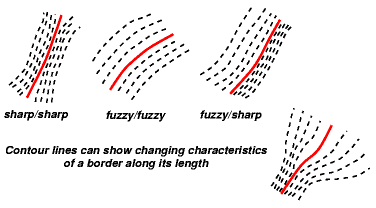
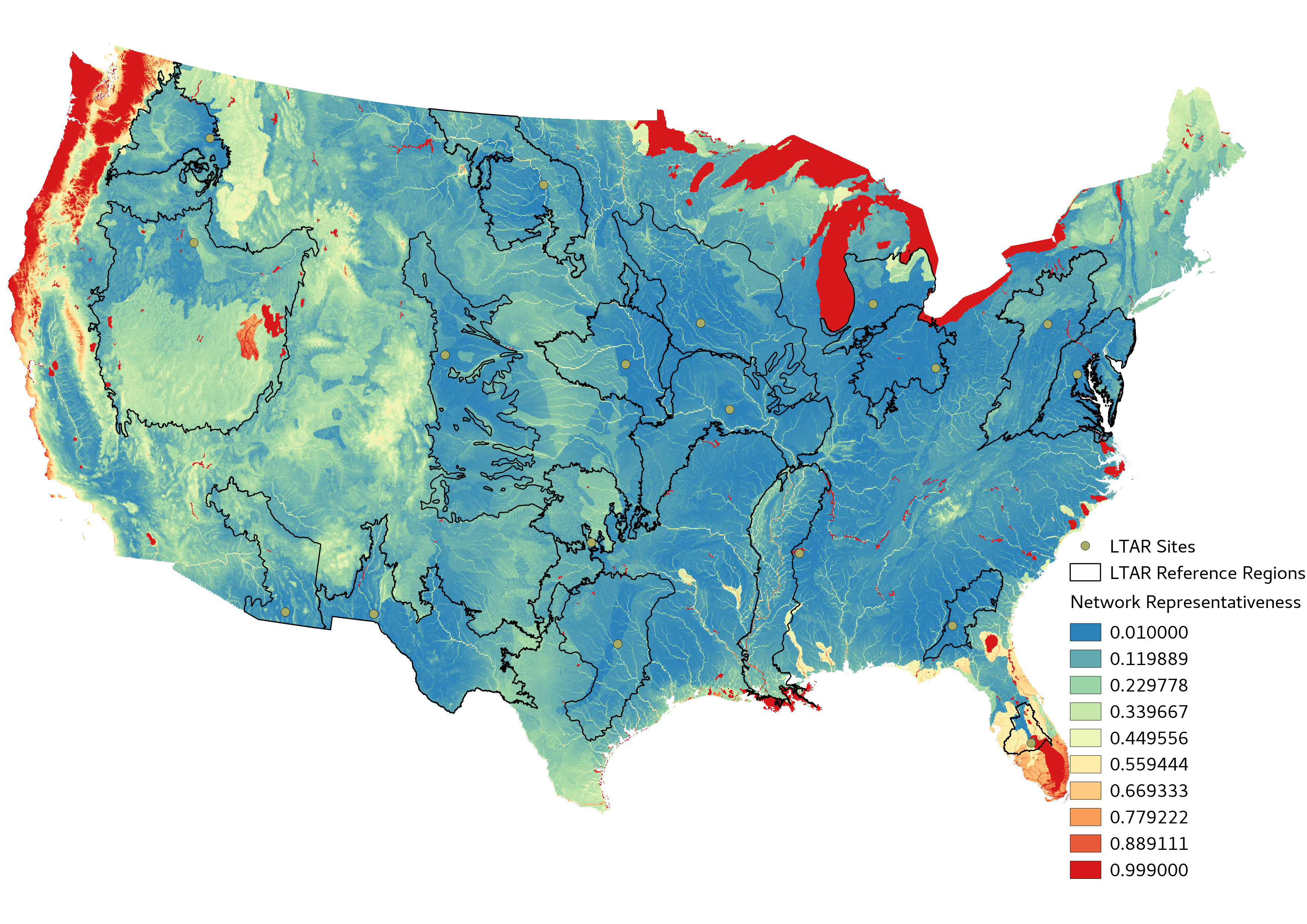
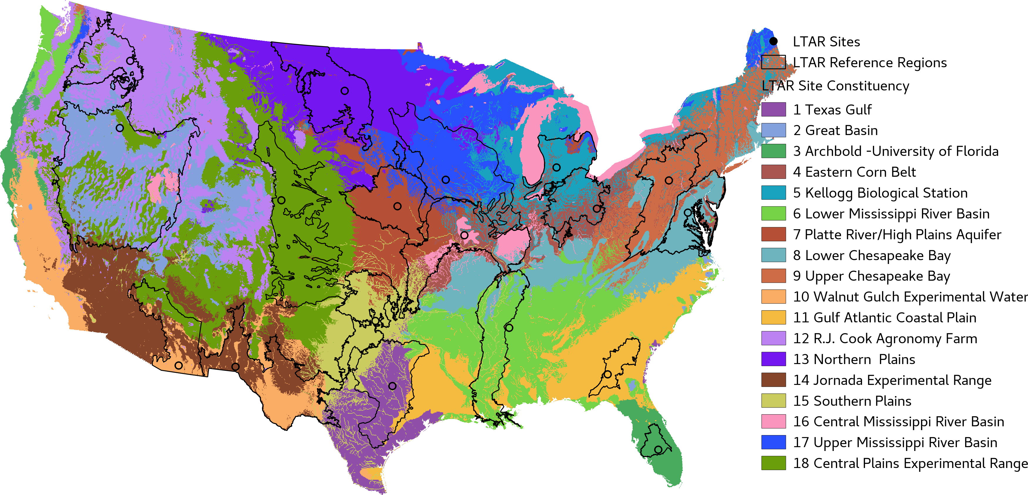
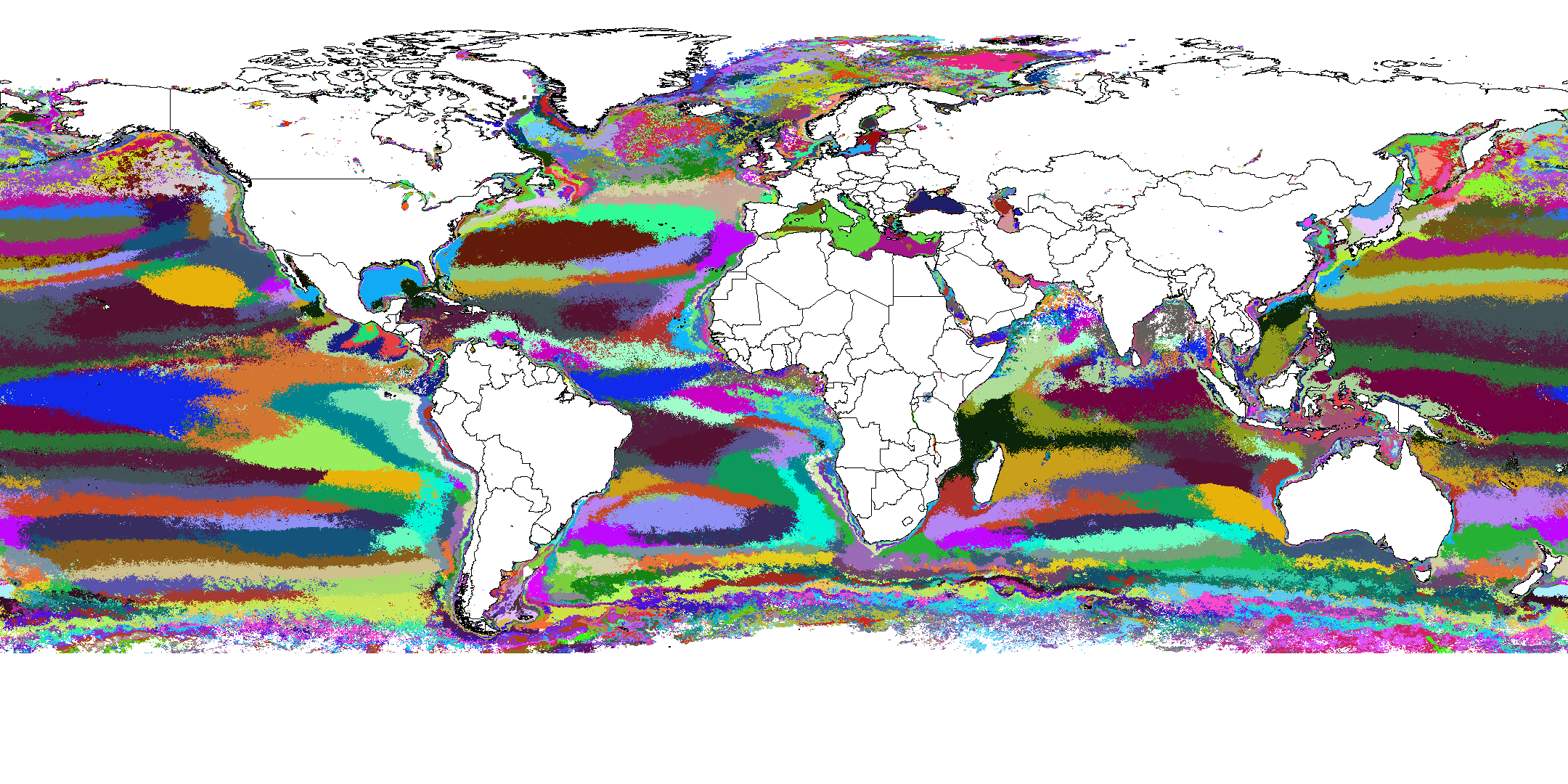
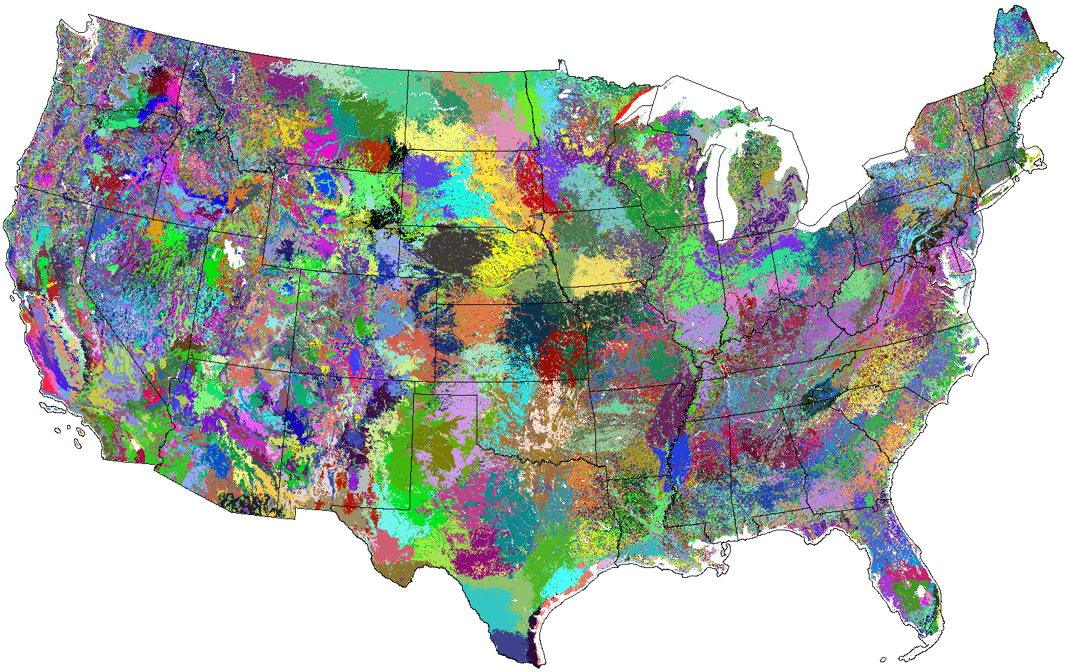
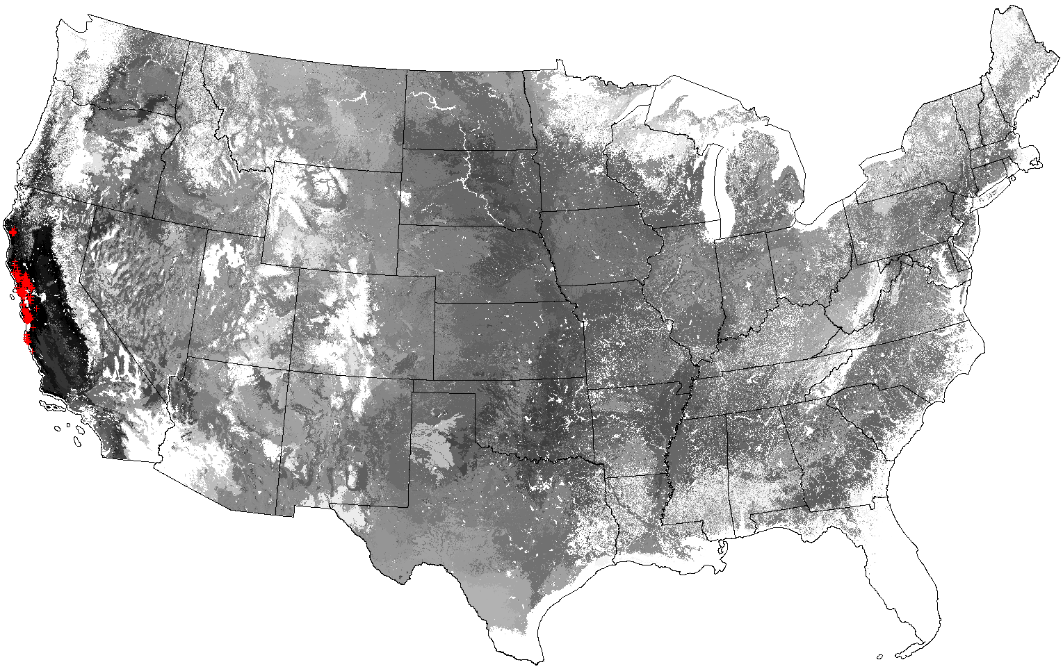
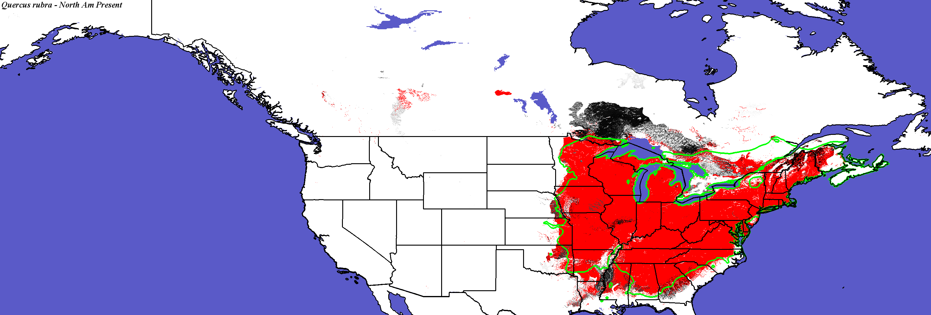
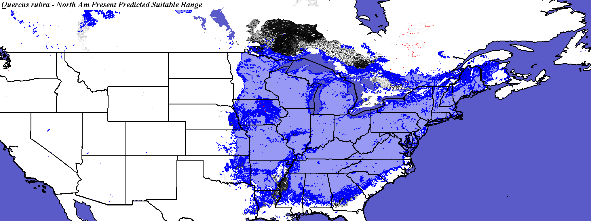
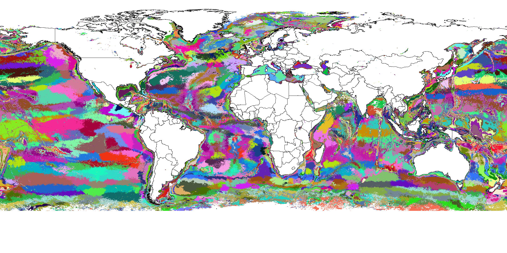
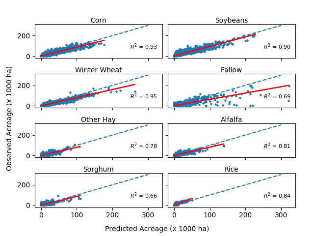
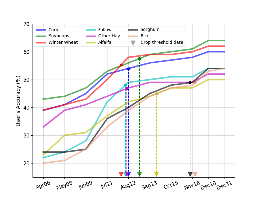
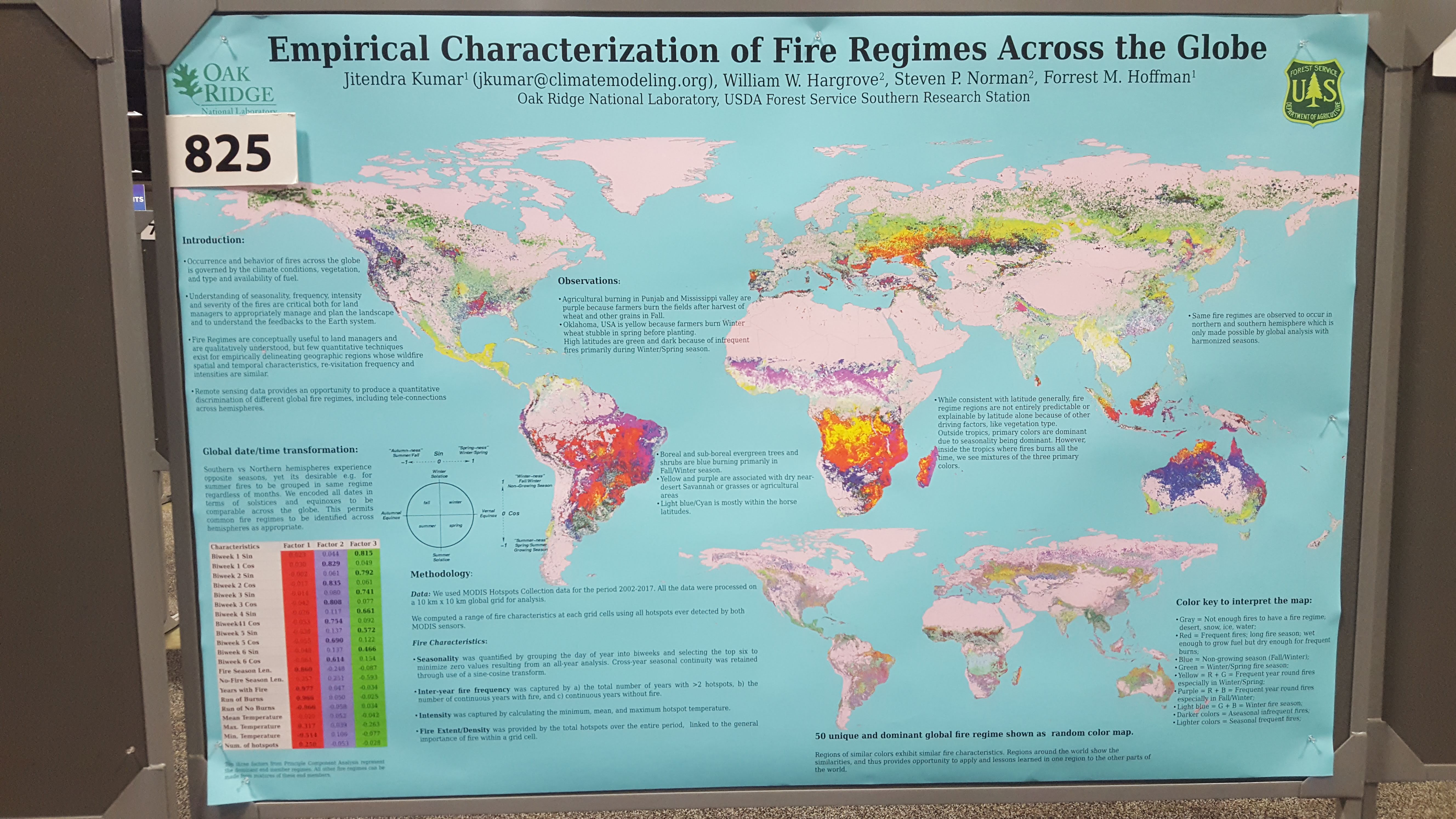
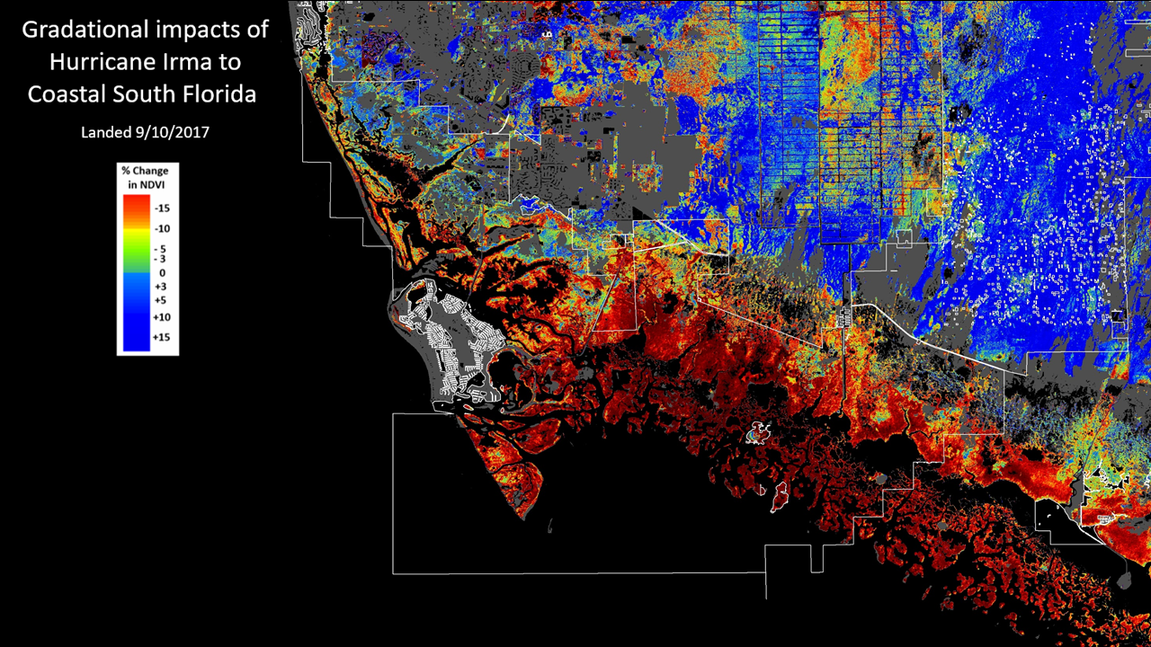
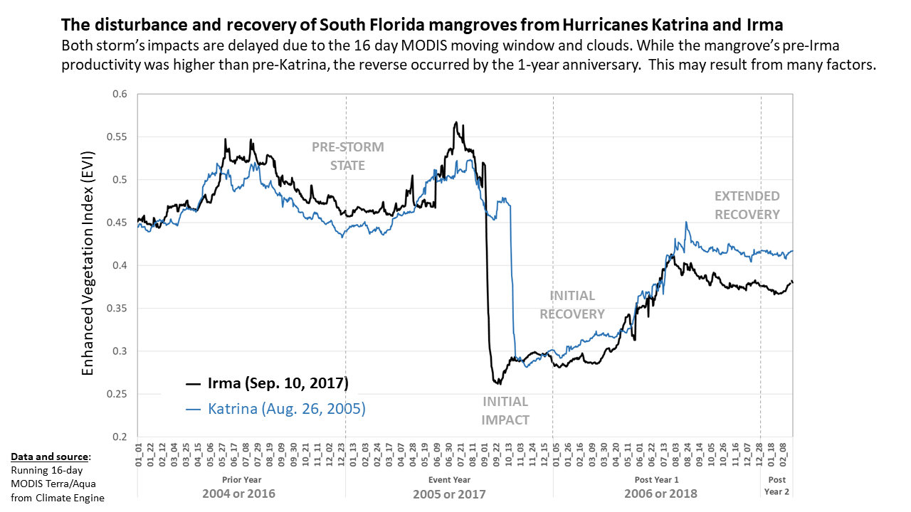
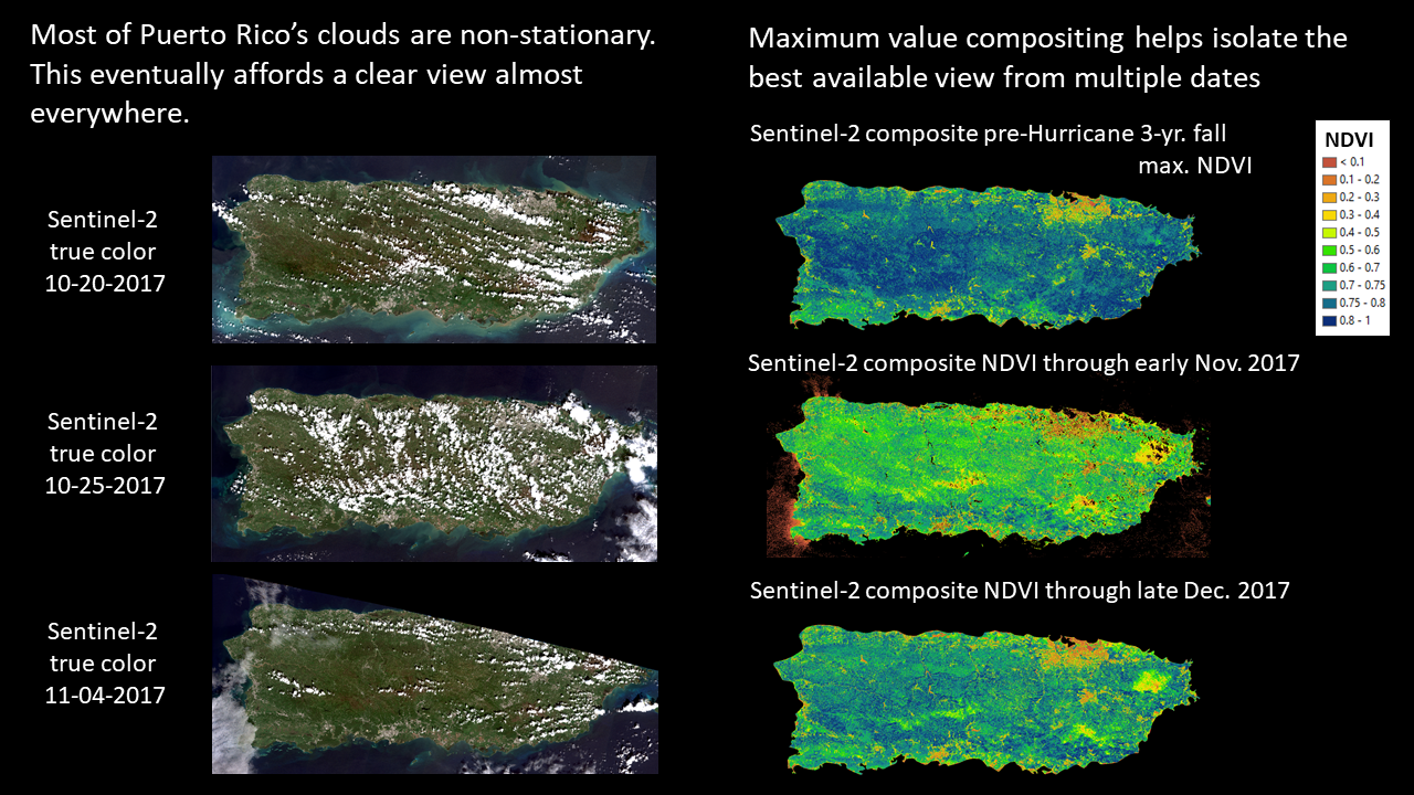
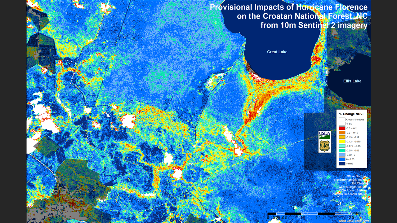
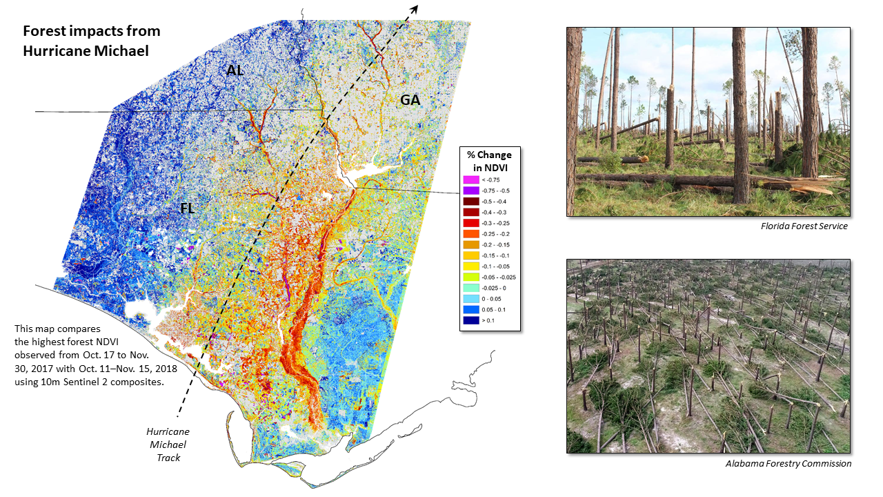
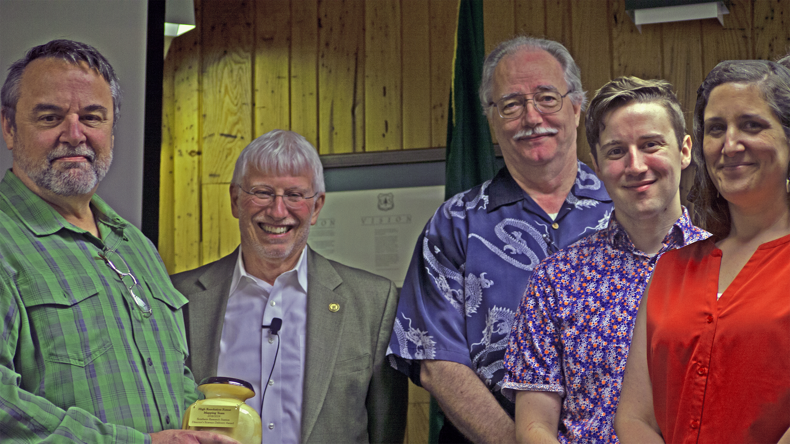
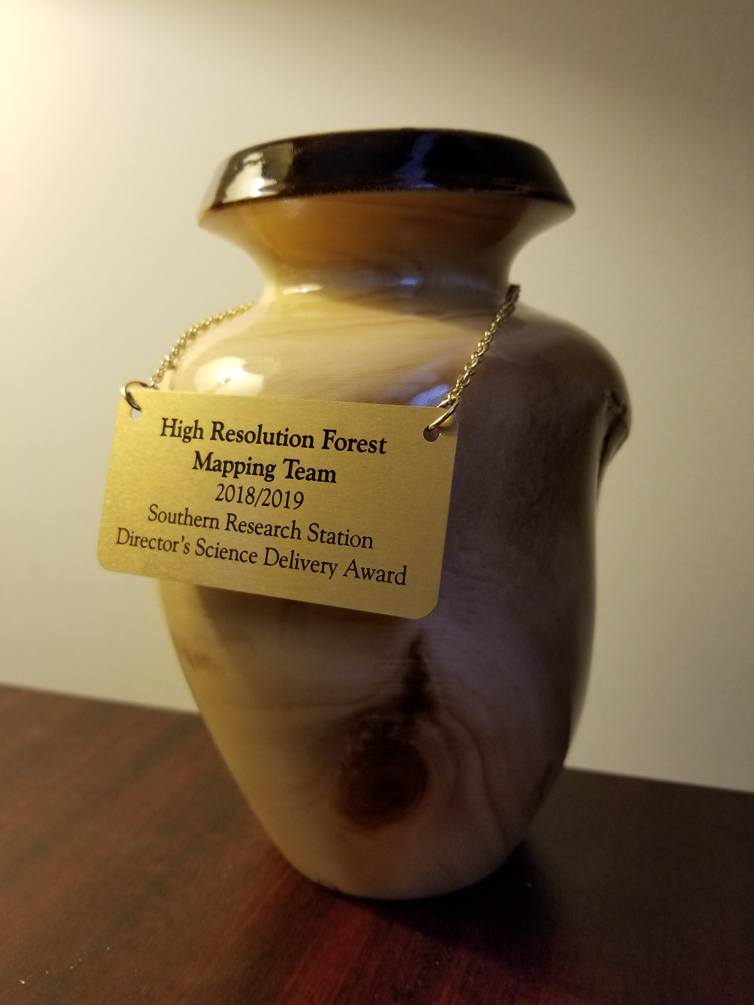
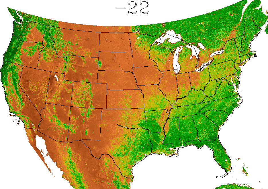
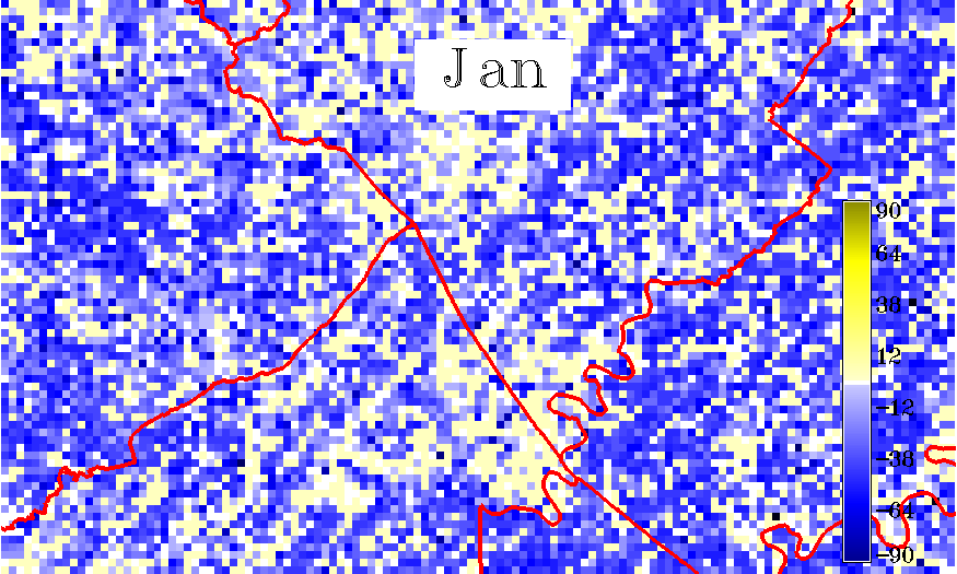