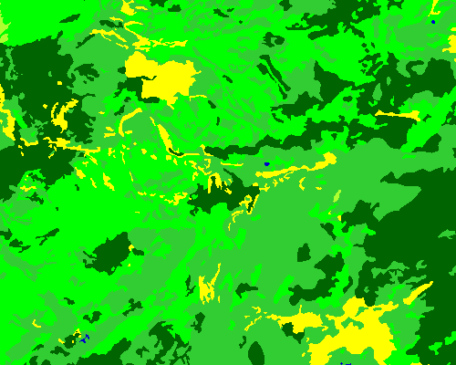
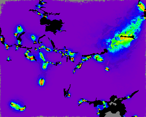
Habitat patches shown as yellow above, black below
Increasing corridor intensity (number of footprints of successfully dispersing walkers) shown by hotter colors
Transfer matrix exactly quantifies successful migrations between patches in map