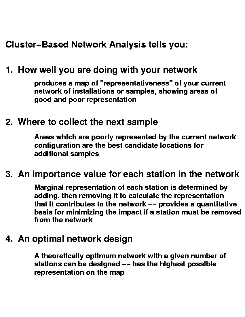
Representativeness and Network Site Analysis Based on Quantitative Ecoregions
William W. Hargrove and Forrest M. Hoffman
William W. Hargrove and Forrest M. Hoffman
Multivariate clustering based on high-resolution maps of elevation, temperature, precipitation, soil characteristics, and solar inputs has been used at several specified levels of division to produce a series of repeatable, statistically-derived ecoregionalizations of the conterminous United States based on 25 environmental variables. The coarser divisions reflect intuitively-understood regional environmental differences, whereas the finer divisions highlight local condition gradients, ecotones, and clines. Machine-generated ecoregions can be produced based on any user-selected variables, allowing customized regions to be generated for any specific problem.
When ecoregions are delineated using quantitative methods rather than human expertise, the quantitative treatment provides a number of ecologically useful related concepts. Two of the most interesting of these related concepts are representativeness, which allows maps to be drawn which show the geographic location of all regions which are similar to a selected ecoregion, and network site analysis, which shows how well a particular network of sites represents a larger area containing the network.
These concepts are of practical use in the design and analysis of networks of installations or sample locations. Once input variables of appropriate relevance, scale and quality are chosen, the coverage and sampling intensity of any network of sites can be analyzed statistically with respect to those selected variables.
Click on any of the images at the left to enlarge them.
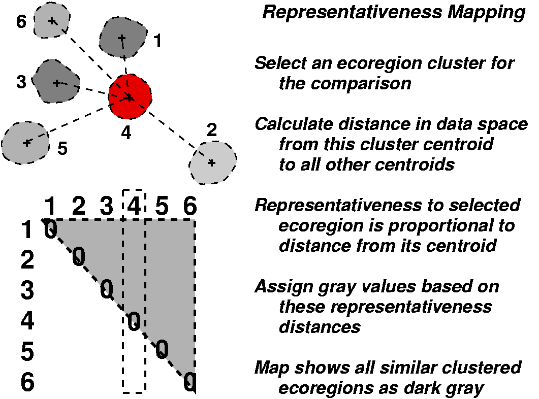
Because the ecoregions are statistically derived, one can select a single ecoregion of particular interest, and then produce a sorted vector of the similarity of all other ecoregions to the selected one. The chosen ecoregion establishes an origin in data space, and, using the Euclidean distance from this origin to each other ecoregion, a pairwise similarity measure can be calculated. Coding these pairwise similarity values as gray levels, a map can be drawn which cartographically shows the degree of similarity of all ecoregions in the map to the selected ecoregion of interest. Darker areas are high in similarity to the selected ecoregion, which is shown in red.
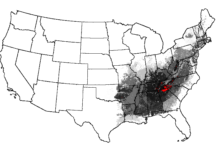
Thus, maps can be drawn which show the degree of innate similarity between a particular selected ecoregion and the rest of the map. Starting with an ecoregionalization based on 25 primary environmental factors into the 1000 most-different ecoregions, a map of "Everglades-ness" can be drawn, for example, which quantitatively shows the similarity of everglades-like conditions elsewhere across the map. The Okefenokee Swamp, the Great Dismal Swamp, the Mississippi Delta, and the Wisconsin/Minnesota "Land of a Thousand Lakes" all rank high in their degree of "Everglades-ness."
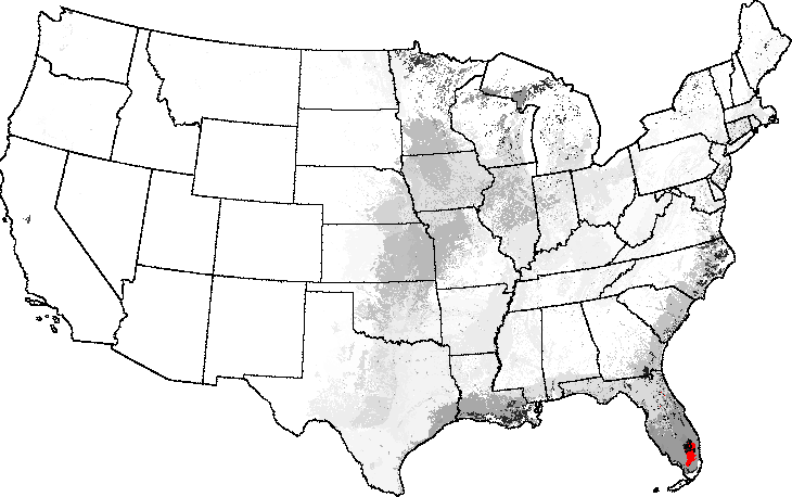
A map of "Smoky Mountains-ness" essentially rediscovers the entire Eastern Deciduous Forest Biome. Interestingly, there is one small spot in the Ozarks and one spot in the Monongahela National Forest of West Virginia which consist of pure "Smokies-ness." The Adirondacks of New York are relatively high in multivariate "Smokies-ness."
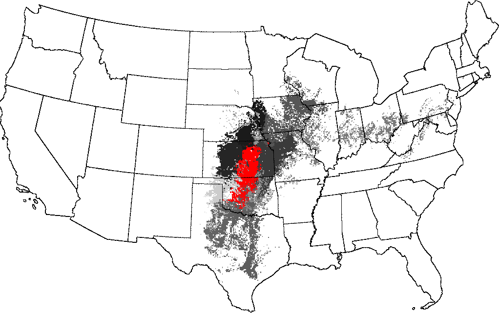
Choosing the Flint Hills as a reference ecoregion, the Central Tallgrass Prairie of Kansas, Oklahoma, Missouri and Iowa is high in similarity. Similarity falls off into Central Texas to the south, and Illinois, Indiana and Ohio to the northeast.
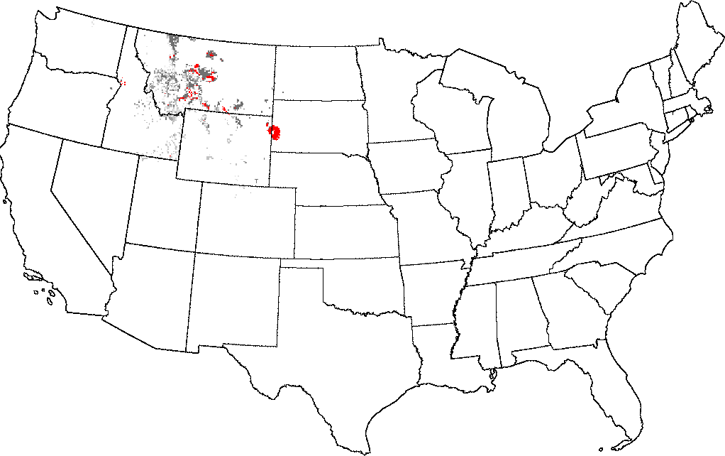
The Black Hills of South Dakota, when selected as the comparator, are fairly unique in the United States. There are only a few areas near Great Falls, Montana that are representative of this ecoregion. These quantitative comparative representativeness maps objectify the sorts of comparisons that ecologists have always wanted to make, but, using traditional expertise-based ecoregions, could only judge subjectively. With statistically based ecoregionalization, it is now possible to make such comparisons among ecoregions quantitatively.
If we invert this qualitative comparison concept to consider anti-similarity or non-representativeness in the context of an existing network of sites or sample locations, it can form the basis for a tool which can quantify the degree of representativeness coverage for a particular established network. A network in this sense consists of a geographic constellation of installations or facilities, or can simply represent locations where samples have been taken. The quantitative similarity is no longer based on a comparison with a single selected ecoregion, but on comparisons with multiple site locations in an established network.
We can construct a site-selection tool, based on the collective
representation of the network, to help determine the best place to
locate an additional site. This best location for a new site will be
the place that is the
Such an analysis can inform several aspects of network design and architecture. Besides showing how well the network represents the rest of the map, the analysis shows the best locations for new sites or installations. Maps showing the geographic areas represented by each individual site can be generated, and importance values for each site based on the calculation of the marginal representation it adds to the network can be calculated. Such importance values can be used to minimize the impact on representation if a site must be removed from the network. Finally, a network with a given number of sites can be designed which is theoretically optimum, having the highest possible representation on the map.
We have developed two methods which quantify different aspects of the degree to which a particular network represents the rest of the map. The first of these two methods quantifies network coverage, and determines whether there is a site or sample located within similar conditions to all other portions of the map. The second method determines how equally all portions of environmental data space are sampled, and tries to ensure that sample intensity is even across all ecoregion conditions. Only the closest site is used in the network coverage measurement, but all sites are used in the calculation of network sampling intensity.
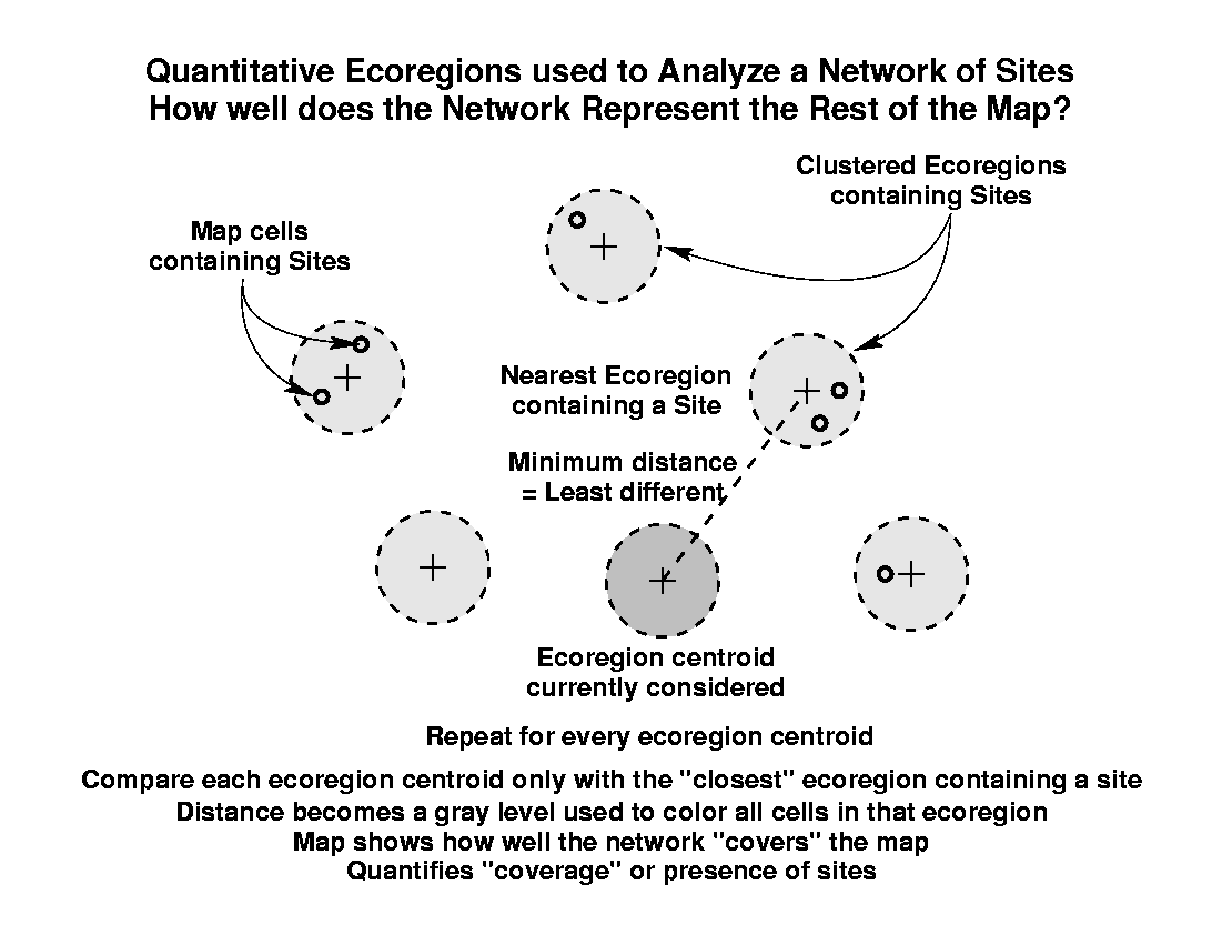
The first method is based on finding, for each ecoregion in the map, the Euclidean distance in data space to the single closest ecoregion which contains a site from the network. As before, this distance is coded to a gray level, and the map which results shows how well the network "covers" the map. Unlike the "Everglades-ness" maps, however, darker areas in network analysis maps represent areas which are poorly represented by the existing network of sites. Since this method quantifies coverage or presence of sites, sites will always sit within well-represented ecoregions, which will be colored white.
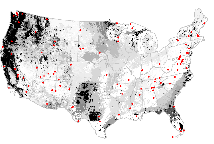
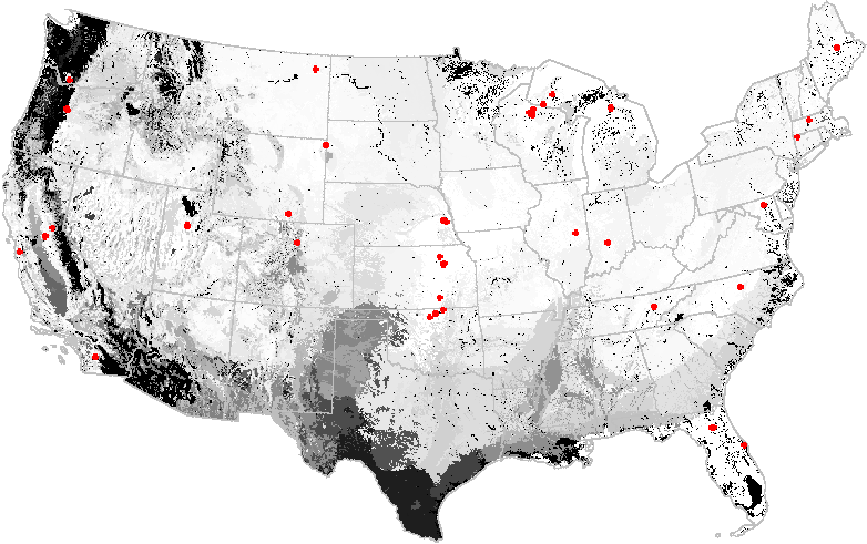
The national parks in the United States can be thought of as a network of refugia or reserves for wildlife. When submitted to a network analysis based on an ecoregionalization into the 2000 most-different ecoregions, the National Park System is found to poorly represent northern and central Texas, as well as the Northern Rockies and the Pacific Northwest. Adding new national parks in these areas would dramatically improve how well the sites in the national park system represent the environmental conditions within the continental United States.
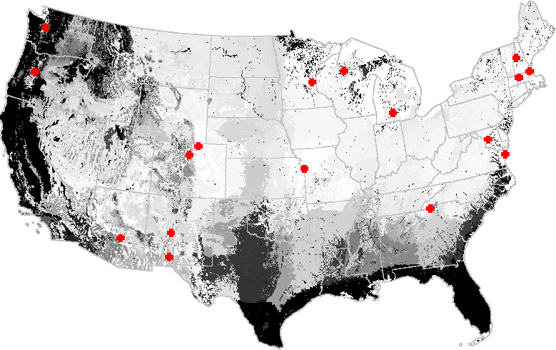
The AmeriFlux network of sites, each of which have a CO2 eddy-flux covariance tower that measures Net Ecosystem Exchange (NEE). Because they are costly to construct and operate, there are only 52 tower sites in the conterminous United States. Based on a general environmental regionalization, Southern Texas, the Sonoran Desert, and the Pacific Northwest are poorly represented by the existing AmeriFlux stations.
A network analysis of the National Science Foundation's Long-Term Ecological Research (LTER) study site network indicates that additional LTER sites in Florida and the Atlantic and Gulf Coastal Plain, the Pacific Northwest, and Northern California would increase the degree to which the existing LTER network represents environments in the United States. Central Texas is also poorly represented by the existing LTER network. Some areas appear in many of the network analysis maps; these may be outlying cluster ecoregions which are far from the center of occupied data space.
A second way to examine the adequacy of an existing network relative to a map which contains it is in terms of evenness of sampling intensity. Perhaps an ideal network should sample all portions of environmental data space with equal numbers of sites, so that ecoregions which are very different or unusual (like the ones which appear repeatedly in the coverage maps above) should contain more sites than ecoregions which are more average. It is not enough to have these unusual ecoregions covered by single sites; they are different enough that they require multiple sites in order to be equally sampled. In this scheme, sites can be located in on areas which may still be underrepresented, so they may appear on darkly colored areas.
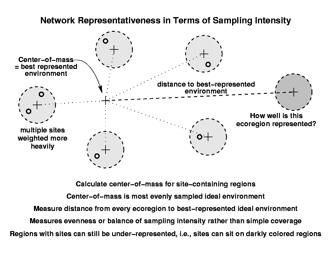
To calculate evenness, first we find the center-of-mass among all of the site-containing ecoregions. This point represents the best-represented, most evenly sampled combination of conditions measured by all sites. The Euclidean distance from the centroid of each ecoregion to this best-represented, center-of-mass point is summed over all ecoregions, and then divided by the total number of sites in the network to produce an average distance from the sites in the network to the best-represented environment. Ecoregions which are far from this center-of-mass will be darkly colored (even if they contain some sites) unless they contain almost as many sites as there are close to the best-represented environment.
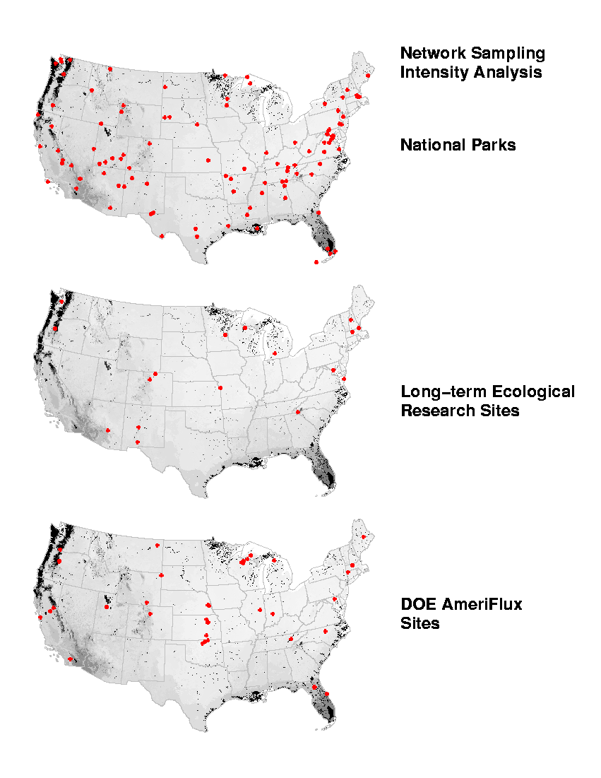
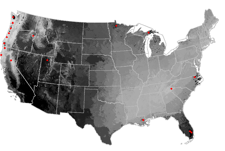
When we analyze the national parks and the LTER and AmeriFlux networks in terms of evenness of sampling intensity, we obtain a surprising result. Even though these three existing sampling networks differ substantially in their number of sites and spatial configuration, the maps showing their sampling representation of the United States all appear to be nearly identical. Why? Has some calculation error been made?
No error has been made. Instead, we have discovered something about United States ecoregions. Sampling intensity is as much a function of the arrangement of ecoregions in environment space as it is a function of the arrangement of the sites. In just the same way that the same "unusual" ecoregions show up again and again in the earlier network coverage analysis maps, so the set of ecoregions which are very different appear repeatedly in these maps of network sampling intensity. The sites in these three existing networks effectively sample the "common" ecoregions, but all of the networks underrepresent the same set of unusual ecoregions. From the maps, we can see that these unusual ecoregions are generally located around the geographic periphery of the United States.
Perhaps a set of additional "imaginary" sites could be added which would represent these unusual ecoregions, and would greatly improve the evenness of sampling intensity for all three of these networks. We added 18 imaginary sites by hand within the darkest areas of the network sampling intensity maps, and then repeated the sampling intensity analysis using only the sites in this new "imaginary" network. The map of sampling evenness of the sites in this imaginary network looks totally opposite (in fact, almost like a photographic negative) from the maps produced using the three existing networks. In the imaginary network, the unusual ecoregions are well-sampled, but the more average central continental ecoregions are not. The Pacific Northwest and mountains are lightly colored, but the central and western U.S. are dark.
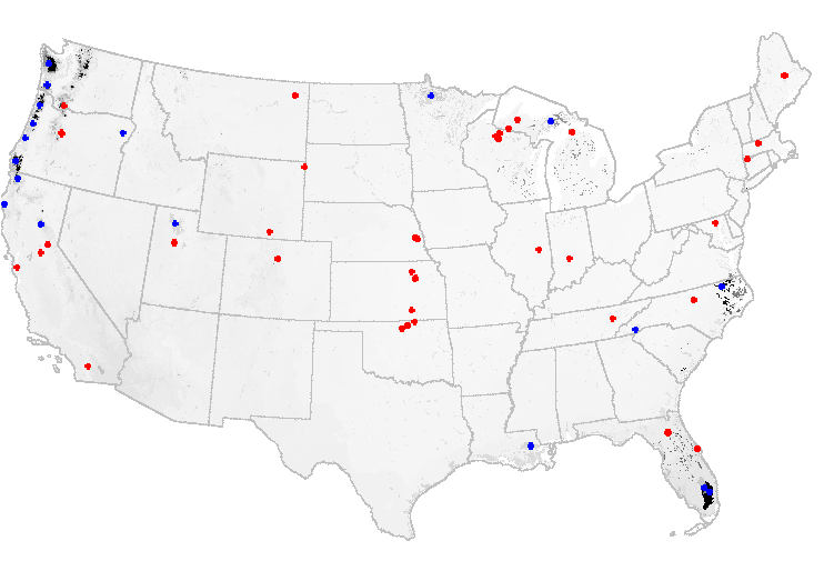
If we combine the imaginary network created above (shown in blue) with the existing AmeriFlux network (shown in red), for example, the sampling intensity map changes dramatically once again. With sites in both the average and the unusual ecoregions, almost all portions of the map are evenly sampled, and the network analysis map changes to a uniform nearly white color. So we can alter the network by adding sites, as guided by the earlier network analysis, and improve the network representation of the rest of the map.
It has already been shown that an existing network can be improved by iteratively performing a network analysis, and then adding more sites in areas which are poorly represented by the existing network. It should be possible, however, for a given number of total sites, to design a theoretically optimum sampling network. Deploying a network which has been initially designed to be optimum maximizes the representation of a particular map, and probably produces a better network than incrementally adding optimal sites to an existing network.
Two different approaches might be employed for the design of a completely new optimized network. One could simply create an ecoregionalization with as many ecoregions as there are to be sites in the new network, and then locate one site per geographic cluster. Alternatively, one could begin with a very finely divided ecoregionalization, and then cluster the existing cluster centroids into as many groups as there will be sites. The two methods would likely produce very similar results.
Once a particular ecoregion is identified which should contain a site, the distance from each map cell to the centroid of the ecoregion can be used to select the best location for the site within that ecoregion. The cell closest to the centroid of that ecoregion is the most representative of that ecoregion, wherever it happens to be geographically located. Using this distance-from-centroid criterion, various potential locations for the site within the identified ecoregion can be ranked and evaluated. One could also include area weighting in the design of an optimum network so that sites are not placed in geographically small ecoregions, even if those regions are very unusual or different. The best strategy for network design is to first get good coverage, and then to secondarily balance the sampling intensity across ecoregions.
The quantitative analysis of networks, as described here, is ecoregion-based. By starting with a very finely divided set of many ecoregions, each ecoregion is small in geographic area. However, sites within a particular ecoregion are assumed to represent that ecoregion perfectly. This is not strictly true. Similarly, some network sites, like AmeriFlux towers, are single point locations. Other sites, like refuges or national parks, are area polygons that are collections of many cells. Area sites and point sites have different degrees of representation. For the analyses presented here, single points were used to represent the area-based sites like national parks. This treatment probably underestimates area-based network representativeness, but provides a quick rough answer.
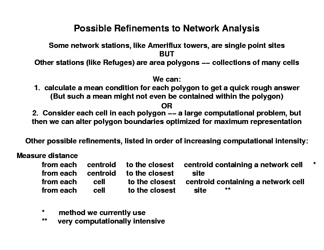
To refine the analysis for area-based sites, we could calculate a mean environment represented by each refuge, and then proceed with the analysis as before using this single point. Alternatively, we could analyze the network based on every cell contained within every refuge as a discrete site in the network. This would be much more computer intensive, but would produce a more refined answer for network representation. One could even see which portions of the area of each refuge contribute the most (and the least) to the representation of the map. Taking this to the extreme, one could perform the network analysis without ecoregions at all, by examining every cell in the map relative to every cell in every area-based site. This would be very compute-intensive, and the results would not likely improve much over an ecoregions-to-cells approach.
We have based these analyses on a set of ecoregions which were delineated based on a set of 25 environmental gradients that are of general interest. Perhaps the most significant improvement to network analysis would be to begin with a set of ecoregions which were custom-created based on environmental factors chosen specifically to be of direct importance to the conditions monitored by the sites in the network. A specific ecoregionalization would form the foundation for the most powerful analysis of coverage and sampling intensity for a particular network. Expanding the extent of the analysis to cover the North American continent (or the globe) would show how well existing networks represent even larger geographic areas.
As with any other analytical technique, the results of a network analysis are dependent on the type, resolution, and quality of the input data. Expertise must be used in selecting the variables to be used as the basis of the network analysis, and all results obtained are with respect to those selected input variables only. Our analysis here, for example, does not account for the fact that sites in a network may have been selected to represent particular fine-scale landcover conditions (for example, the Bondville AmeriFlux site sampling agricultural crops, the Florida AmeriFlux sites sampling clearcut pine plantations at various times since disturbance, the North Temperate Lakes LTER site sampling lakes, and the Baltimore LTER studying urban areas). If deemed important (and available), the input data used in the analysis could be changed to include such fine-scale land use conditions. Once selected, the data layers used are open to examination by others, and, if independently repeated by them, the network analysis would yield the same results.
Sites in even large-budget networks have been established in opportunistic, political, or constraint-driven ways, relying on serendipity. The quantitative delineation of ecoregions provides a basis for objective network design, analysis, and planning. Quantifying and mapping areas of a geographic region which are well-represented by sites in the network provides a way to identify where new sites should be placed, and to identify which sites could be eliminated while minimizing the impact on representation. The technique is simple and defensible, and provides the first objective guidance for network evaluation.
For additional information contact: